The Assimilation of Text by Image
Jhave's wide-ranging history and prospectus alerts us to cognitive, material, and mythic dimensions of the nexus of image and text. By showing how text evolved into image, the essay traces a new malleability, dimensionality, and embodiment of writing. The contemporary image-text is a quasi-object with experimental literary qualities as well as an almost organic media dynamism.
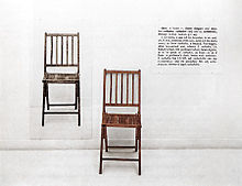 In computer science terminology, some things are called pointers. Pointers, as expected, point toward other data. One way of understanding language is to see words as pointers. The word chair points toward a real chair. The word wet points toward the quality of wet. Joseph Kosuth famously questioned this capacity in his 1965 work One and Three Chairs. In Kosuth’s work, one chair is real; one is abstract (the word chair and its definition); and the third chair is a representation (a photo of the chair).
Obviously, the word chair is not shaped like a chair. This lack of visual connection between a word (pointer) and what it points toward is what the linguist Ferdinand Saussure famously termed the arbitrariness of the sign. Digital technology offers to heal that arbitrariness.
On Medium Specificity: The poet Charles Bernstein (echoing, expanding and warping Kittler and others) describes how the rise of documentation technology shifts the role of poetry. For Bernstein, documentation technology means poetry must deal with the materiality of language; for LANGUAGE poets this materiality involved semantic interrogation and satire. For letterpress poets like Johanna Drucker, materiality encompasses the entire range of print technology.
In digital contexts, mediated letterforms can become what they represent: objects in 3D environments. As language becomes what it represents, it is, in some cases, assimilated by images.
The next sections provide a cursory (non-comprehensive) history of the evolution of text into image, followed by an examination of how text-image conjunctions arose.
1.1 A Cursory Evolution
Honey Talks
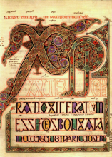 In the Middle Ages (from 5th-15thcentury), illuminated manuscripts gave text the status of visual object. Interwoven recursive letter-forms evoke ancient actualities: fire-smoke and cloud paths, intestinal entrails, and molten lava. The letter is world made flesh. It becomes more than its semantic meaning; it is a composite hybrid perched between reading and witnessing. These are the ancestors of 3D modelled typography, networked attention attenuation, motion graphics, and visual language in poetry.
Priests, Pubs & Psychedelia. Illuminated manuscripts, glass-sign-painting in pubs and psychedelic record covers all reflect the urge to recursively decorate letterforms until they appear as entities or forces within foliage. Illuminated manuscripts are basically ads for an ideology (advanced inscription plumage in the ruthless hunt for souls); while pub-signs hunt buyers of stout. The significance of these practices is that they physically emulate forms of choreography, continue the bombast of the Baroque. The curlicue swirls that adorn these letterforms are the typographic-equivalent of the death flourishes of Sarah Bernhardt or the guitar licks of Jerry Garcia: torsional excess, magnetic vortices seeking to entice. It is easy to denigrate melodrama as trite from a distance, but everyone’s tragedy is someone else’s greeting card. What interests me about the ecstatic flourishes that are in typography from ancient times up until After Effects ribbons, is that there is something being expressed here that leverages archetypes: thirst, paths, labyrinths, forests, breast…
What is expressed in folding flowing, illuminated scripts? I would guess that it is a complex knot of luxury (honey, melted gold), heraldry (status, shields), labyrinth (reading over and over until a message at the centre like a lure is taken or takes), and solidity (a sense of the letter as a thing that has weight, and by association its message is heavy and profound). What these features share is that they are all primarily attributes of matter. They reference the world directly in ways that do not require literacy; they are read by experienced embodied subjectivity. As humans, we have tasted honey, known or heard of gold, walked a labyrinth (or studied a curl of smoke), and held things in our hands. So the typography is speaking to the body at a lived level. It is engaging with the energy of our hands, muscles, and tongue.
Theoretical Precedents. The history of visual poetry has been extensively documented. Dick Higgins, Florian Cramer, Richard Kostelanetz and Johanna Drucker (eminent among others) have each independently contributed to the now widely recognized lineage running from petroglyphs, illuminated manuscripts, picture poems, Dada, Lettrist, Fluxist, Concrete and book arts. The story often cites Sterne, Apollinaire, Mallarmé, Tristan Tzara, John Cage, and Jackson MacLow. It is a field of variations and intensely diverse styles.
After the tongue gave birth to speech, the soft pressure of a stick or finger conceived written language. At the origin of written language, several disciplines are fused; the impulse to make marks and leave traces is an aspect of sculpture (scratching the surface), painting (marking the wall), and writing (which might have developed as an outgrowth of counting, transactional memory). It is only as systematized symbols torque indecipherability toward shared sentience that language is born and becomes separate from the abstract or representational disciplines of sculpture and painting.
Language then grew separate from vision and touch for millennia until the printing press made the masses literate. Now digital media is once again making typography malleable and tactile. Language has come full circle to its roots in mud. Fingertips that touch the screen are touching ancestral processes.
Precursors
“Forme d’expression poétique qui entend traiter la langue comme matière et l’espace comme agent structurel du poème…” Pierre & Ilse Garnier. Spatialism Manifesto. 1962Manifeste pour une poésie nouvelle, visuelle et phonique. Retrieved from online http://crdp.ac-amiens.fr/garnier/article21.html on March 11th 2009. Translated: “A form of poetic expression which treats language as matter and space as structural agent of the poem.”
Basically, visual language’s primary users are marginalized radicals (poets) and pop-culture manipulators (ad-makers). Page poets for the most part shun it. The following section examines practitioners persisting on the edges, subsisting in the interstices, resisting exclusion, and converting the machinic and visual into the intimate flesh of poetry.
Practicioner Precendents. Dick Higgins wrote Pattern Poetry: Guide to an Unknown Literaturein 1987, a thorough compendium of hybrid visual poetics through history. Kenneth Patchen’s sustained polemics from the 1940s through 1970s created a parallel infantile mystic space for visual experimentation: quasi anarchy ruled as sentences spanned multiple pages. Bp Nichol and Steve McCaffery claimed the typewriter as a tool for dirty concreteThanks to Lori Emerson for re-introducing this term: http://loriemerson.net/tag/dirty-concrete/; mail-art flourished. Kitasono Katue, in a “A Note on Plastic Poetry” (1966) was one of the first poets to recognize that representational technology offered an expanded toolset for poets, “The camera is fit to be used expressively by poets.”Katue, Kitasono “A Note on Plastic Poetry.” (1966). Retrieved from http://www.thing.net/~grist/ld/japan/KIT-3.HTM March 2, 2009. For Katue, poems were devices. Poetry and image merged.
A Brief History of Types
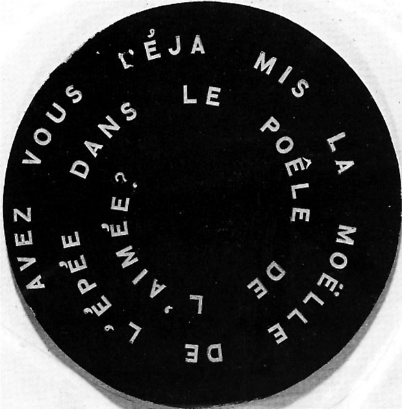 Florian Cramer has documented how ancient Kabbalists used generative systems of symbols to construct taxonomies of divine language. These systems often took the form of wheels of categories. Cramer is concerned with the programmatic permutational implications of these constructions, but they also visually resonate with Marcel Duchamp’s 1926 film Anemic Cinema, an early example of animated text on film. Duchamp’s Anemic Cinema anticipates animated visual poetry and forms a useful link between ancient clay glyphs, potter’s wheels and petroglyphs, motion graphics, and spinning digital media: disk drive, laser disk, CD-ROM, DVD.
Spinning. In Anemic Cinema phrases painted in spirals onto a flat disk are rotated at constant speed and filmed. The result is a film that expects the reader to read inward from the edge to the phrase’s end near the spinning centre. Anemic Cinema seems to reference the algorithmic alchemists with their circular charts and spiralling meanings as it simultaneously anticipates the mobility and motility of digitally animated text pulled along curved paths. In Duchamp’s film spirals of text painted onto wheels are spun in ways that only permit a reading if the eye slips in or out along a serpentine labyrinth. Vinyl LP grooves existent in gramophone recordings may have been the inspiration. Certainly the vortices of Hitchcock emulators and Brion Gysin’s Dream Machine are descendants. Reader flexibility is necessary: the poetic line is not flat, it is curved. Semantic impact emerges over time.
Anemic Cinema derives its visual energy from mechanical rotation. This evokes the origin of malleable language: the clay potter’s wheel spinning so that fingers dragged from the centre to the edge form patterns evocative of nebulae or galaxies. In Anemic Cinema, geometric nebulae pattern segments function as visual punctuation between each of the text segments. The text segments revel in puns, spoonerisms and aphorisms; they semantically spin nebulas of potential meaning. The geometric interludes form a visual counterpoint or rest to allow the text’s spiralling meanings to be digested. Several of the geometric segments succeed in conveying a three dimensional quality that anticipates the slab extrusions of CGI cylinders.
Opacity: “a revolt against [the] transparency of the word”
Concrete poetry is the obvious 20th century precursor of visual digital poetry. Concrete poetry situated itself as a visual poetry: “a revolt against [the] transparency of the word” (Rosmarie Waldrop in Perloff 114).
 But where concrete poetry was purely about the word (distancing itself from collage and hybrid practice), time-based malleable digital poetry (as I create and conceive it) is about image (conjunctions, assimilations, permutations) and flow.
Visual digital poetry involves opaque typography composited into images. In this context, o**paque typography induces a semantic oscillation between the pictorial and the literal. This oscillation challenges the foundation of typography’s transparency dogma and complicates stable interpretations.⏴Marginnote gloss1⏴Kac offered a key early account of his take on holopoetry in ebr: http://www.altx.com/ebr/ebr5/kac.htm (that’s the original appearance, and here also: http://www.electronicbookreview.com/thread/electropoetics/uncontrollable)
— Joseph Tabbi (Oct 2012) ↩
Sensual Concrete. There is a difference between the way concrete movement was conceived (as semantically pure attention to language’s visual element) and the works produced, which are often sensual aesthetic organic lush and personal visions. An emotional relation to the work has ontological implications: it is a stepping stone, precedence on the path toward immersion with other, even if that other is nature (a totalizing enveloping system) or language (an abstract recursive vehicle).
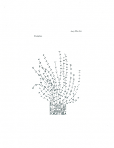
Mary Ellen Solt exemplifies the contradictory impulses in concrete poetry, her work falls into (what I will call) sensual concrete. Her critical writing (Concrete Poetry: A World View) echoes the ideology of concrete’s origins: “… there is a fundamental requirement which the various kinds of concrete poetry meet: concentration upon the physical material from which the poem or text is made. Emotions and ideas are not the physical materials of poetry. …the material of the concrete poem is language… [ the concrete poem ] places a control upon the flow of emotions” (Solt 59).
Eduardo Kac: Holo and Bio Poetry
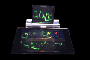 In 1986, Eduardo Kac claimed that Holopoetry provides “an extreme, pluridimensional level of complexity. This new holistic perception, source of the fruition of real immaterial objects, volumes without mass, requires a response in the structure of language: the possibility to transform the instrument of intellectualization - the word - into a sign as fluid and elastic as thought…” (Kac 129).Also see Kac 1995: http://www.ekac.org/holopoetrybook.pdf
From Holo-poems to Bio-Art. Bodies in cities are read; we read each other using fragmented codes. Similarly, in the 80s Kac viewed his holopoems as discontinuous multiple perspective spaces where reading proceeds by ruptures. Words fracture into shards of light, signs “change or dissolve into thin air” (Kac. 1989). It is this multiplexed stability that is shared with bodies: temporal ephemeral units extruded from evolutionary imperatives, bodies die as do holopoems when the power goes out.
Kac encapsulates a continuity of lineage between bio-art and dimensional poetry. He links DNA, the bible and code as in his 2001 work Encryption Stones, a laser-etched black granite diptych that translates the canonical passage from Genesis (“Let man have dominion…”) into Morse code and codon sequences. These are cultural transcriptions that operate authoritatively at the membrane between archaeology, chemistry and information processing. These are poems that visually assert and literally subvert the force of authority by decomposing the Book into stone that is a mere cipher for a much richer living code. Dimensional poetry politicized by referencing distinct domains of expression, “critically reveal the intersemiotic operations that lie at the heart of our current understanding of life processes.”*Works from the Gen Series.*Eduardo Kac. 2001. http://www.ekac.org/genseries.html Retrieved Oct. 2010.
Peter Ciccariello : A painter-poet
The major painters of our era are 3D artists. Commercial pressure and opportunity has led them to Disney, Pixar, and ad boutiques. Film credits, websites, and music videos pay the bills. This exodus along the cash gradient makes it difficult to find poets exclusively devoted to the craft of exploring software as an extension of painting. A rare example of a poet-painter is Peter Ciccariello.
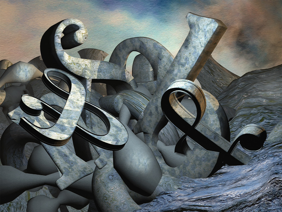
Polygon wracking language into amorphous clumps, Ciccariello‘s work prefigures ecosystem anima, data-set network organisms whose flesh extrudes from static reservoirs into boiling agency. These are anticipatory static representations of future living language, washing up like seaweed in the depths of dark fibre.
Peter Ciccariello develops dense baroque tangles of words and images. Letterforms so thick they are like oil painting done by a hurricane, modeled in 3D digital,Ciccariello uses Bryce, Maya and a complex chain of softwares to render his poems. texture mapped with chaotic camouflage onto visual fields where distance and intimacy exchange places. Letters in these computer-enhanced paintings seem to have been caught in the process of rolling over or emerging from mud. Their forms bear weight and cast shadows. Images merge with gestural clots of colour that confuse reading, confounding any singular critique that does not accept the imminence of text as object.
Ciccariello’s work emerges from abstract expressionist and collage traditions (and actively defies the sterilized flat uni-dimensional constructivist styles of concrete poetry). Committed to the principles of painterly explorations, these are non-participatory, figurative, colour-field steps on the path of dimensional type. Ciccariello is an outlier, whose adoption of 3D modeling, points to a social change in praxis for language artists.
Programmer Poets
The tactile plasticity of painting language is being incorporated into poetry by both those who use software (painters like Ciccariello) and those who create it (coders). Coding as cultural practice involves many levels at which textual representations emerge. No longer constrained by the limitations of software, code-practitioners are creating their own paths, coding custom interfaces and structures that evolve over time.
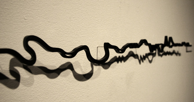 Donald Knuth: father of programmatic typography.“Like a poet has to write poetry, I wake up in the morning and I have to write a computer program.”Donald Knuth cited in Platoni, Kara. “Love at First Byte”. Alumni News Stanford. 2006. Retrieved from http://www.stanfordalumni.org/news/magazine/2006/mayjun/features/knuth.html Dec. 2009.
The parametric creation of font shapes for aesthetic purposes originated with Donald Knuth’s Punkfont produced using his software Metafont. Originally published in 1988, these fonts were inspired in 1985 when Knuth heard that “Typography tends to lag behind other kinds of stylistic changes by about ten years” (Knuth. 391). He immediately set about perturbing some control points by random amounts, “I had my first proof output 20 minutes later” (Knuth. 395). Thus the practice of programmatically creating digital typography for aesthetic purposes was born swiftly intuitively and without much fanfare. And with this Knuth earns his title as the first hacker of visual poetics.
From a living language poetics perspective, programmer-poet explorations constitute research into metabolic systems, explorations of structures capable of supporting quasi-autonomy, junctures where letterform and data-structure fuse.
**Peter Cho.**Contemporaneously with J. Abbot Miller’s Dimensional Typography, Peter Cho (an award-winning designer who later received a fine arts master from UCLA and a masters of science from MIT) began to release typographic experiments that stretched conceptions of type as a carrier for meaning; the boundaries were stretched digitally with a zen-like precision using programming and rendering. His concerns place him at the membrane between an artist, a poet and a designer, but his consistent focus has been fonts, glyphs and the squirming squiggles of the semantic word. In 1998, Peter Cho developed the Forefont type. “These letterforms stemmed from dissatisfaction with flat, texture-mapped type that disappears when rotated in a virtual three-dimensional environment. Forefont type pushes up against a grid and retains its “bumpy” profile when tilted towards the viewer.”Peter Cho. http://typotopo.com/projects.php?id=forefont Retrieved May 2009.
In the same year (1998) Cho developed a storm swarm 3D algorithmic text, Nutexts: “Nutexts is a series of experiments exploring three-dimensional space through typography. In each experiment, the text of a short or medium-length written work is laid out in a virtual three-dimensional environment according to a set of simple metrics or rules.”Peter Cho. http://typotopo.com/projects.php?id=nutexts Retrieved May 2009. Spatially configured layouts correspond to virtual architecture, precursors of presence.
Cho’s 2008 work Wordscapes continues the process of exploring dynamic force and participatory 3D typography. Interactive thoughtful and brief, one word for each letter of the alphabet is mapped to a set of mouse-sensitivities. The interactivity amplifies the semantics; it is animation in the classic sense. This is Warner Brothers’ not Dostoyevsky; behaviours do not change over time, but each in its succinctness satisfies and nourishes expectation.
Cho’s work that reaches the deepest (for me) is Takeluma a speech-sensitive installation completed in 2005. Takeluma reminds me of Kurt Schwitters if he had been exposed to shape-memory alloy. It is in essence a project that directly explores synaesthesia (between the sound of words and the forms we associate with them) and develops a speculative visual idiom. Cho’s description: “Takeluma is an invented writing system for representing speech sounds and the visceral responses they can evoke. Takeluma explores the complex relationships between speech, meaning, and writing. While modern linguistics suggests that the relationship between signifier and signified has no discernible pattern, poets and marketing experts alike know that the sounds of words can evoke images which elicit an emotional impact. The project explores the ways that speech sounds can give rise to a kinesthetic response. The Takeluma project comprises several animated and print works and a reactive installation.”Peter Cho. http://typotopo.com/projects.php?id=takeluma Retrieved May 2009.
By loosening language from the strait-jacket of definition, Takeluma explores a tentative hybrid between linguistics, abstract art and sound poetry; this occurs formally, intellectually and physically. Speech acoustics bind to letterforms. Takeluma’s audio waveforms are ribbons, worms that extrude into space. These are precursors to letterforms that directly correspond to the body’s internal resonant cavities, letterforms capable of expressing archetypal congruences between acoustic forms and felt semantics.
Ben Fry’s Tendril
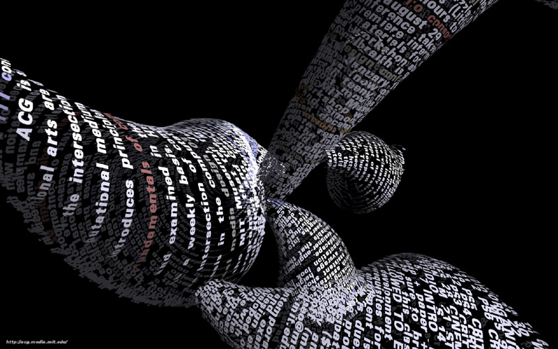 In the domain of dimensional typography with implications for digital poetry, there are some prescient pioneers. Ben Fry’s (2000) alternative web browser called Tendril sets precedents aesthetically and technically. In Fry’s words, “Tendril is a web browser that constructs typographic sculptures from the text content of web pages. The first page of a site is rendered as a column of text. Links in the text are colored, and when clicked, the text for the linked page grows from the location of the link.”Ben Fry: http://benfry.com/tendril/
As Tendril’s text dynamically grows it is woven into bulbous 3D threads that evolve over time into spinning bloated rhizomatic tubers. The surface of these structures is visually composed of text. These are now visual objects, hybrids or chimeras: data-mining refuse (conceptual probes into knowledge and reading), modulated geometric primitives (abstract visual art), and animated organisms (information visualization of biological memes). Tendril is a quasi organism and a hybrid cultural entity, it feeds on text, digesting it into rhizomatic skin. Tendrilautomates appropriation; it is like Flarf exponential: reconfiguring what it retrieves into a format that is readable as tumescent infinities.
Obviously, legibility is not the key pleasure involved in most typographic sculptures. These redolent forms, undulant in black space, swollen with language, are unreadable. The reading machine process programmed by Fry operates unseen behind the screen, engorging itself on text that stretch into curves that ripple as they excrete networks. This is sculptural animation that occurs in an on-screen ecosystem. And since it is no longer visible live it is also a fossilized excretion (the residue of Tendril is a few movies and jpgs and probably a snarl of code rendered inoperative by shifts in network protocols). So what the documentation provides is evidence (but not the actuality) of the passage of an incipient text-eating network-organism, a progenitor of creatures that will roam the net eating words and shitting pulsating rhizomes.
For me, Tendril is a canonical example of time-based language-driven digital art that simultaneously satisfies aesthetic and conceptual criteria. Naïve viewing derives satisfaction from the organic suppleness of its form unravelling from nothingness; informed viewers derive additional stimuli by contemplating the interaction of networks at an abstract level.
What’s also interesting about Fry’sTendrilis how amenable it is to both cinematic and computational critiques. The archetypal story of cinema is the chase scene (hunt or seduction); **Tendril’**s morphology can be read as extruded paths, tunnels of words through which we seek each other. Perhaps these are the vibrant paths of preening literary culture, the excess verbiage of reporters, the infinite roots of a forest of bloggers, the frying dendrites of epiphany prone poets. Or perhaps these tubes are spaces of latent intent, topologies where words seek each other.
Let’s push the metaphor into embodiment: curvaceous and plush Tendril evokes language’s guts, the throats of oral storytellers, and the fallopian tubes of Orphic oracles. In the trembling of its languaged surfaces, it is possible to read culture as a single tongue. At the same time as it seems to invite metaphoric transplants and poetic close-readings, Tendril denies this possibility; its river of words pass by in fragments of texture-mapped polygons rotating away from the eye like whales breaching in oil. Any oscillatory rivalry between legibility and pictorial subsides quickly into pure pectoral awe: watching Tendril flex its form takes precedence. Aesthetic instinct trumps contemplative text.
Tendril stripped of its semantics remains capable of conveying thoughts viscerally; it speaks to the articulate muscles in us. It is the writhing hollow intestines of poetry itself articulating a challenge to both authorial intent and flat page, offering a generative leviathan inflated into kinematic writhing. Tendril is the ancestor of language that will feed off network content and reconfigure phrases into its own volumetric flesh.
Karsten Schmidt: Type & Form
Post-Spectacular studio, directed by Karsten Schmidt, develops dimensional typography experiments that operate at the boundary between animation, code, and sculpture.
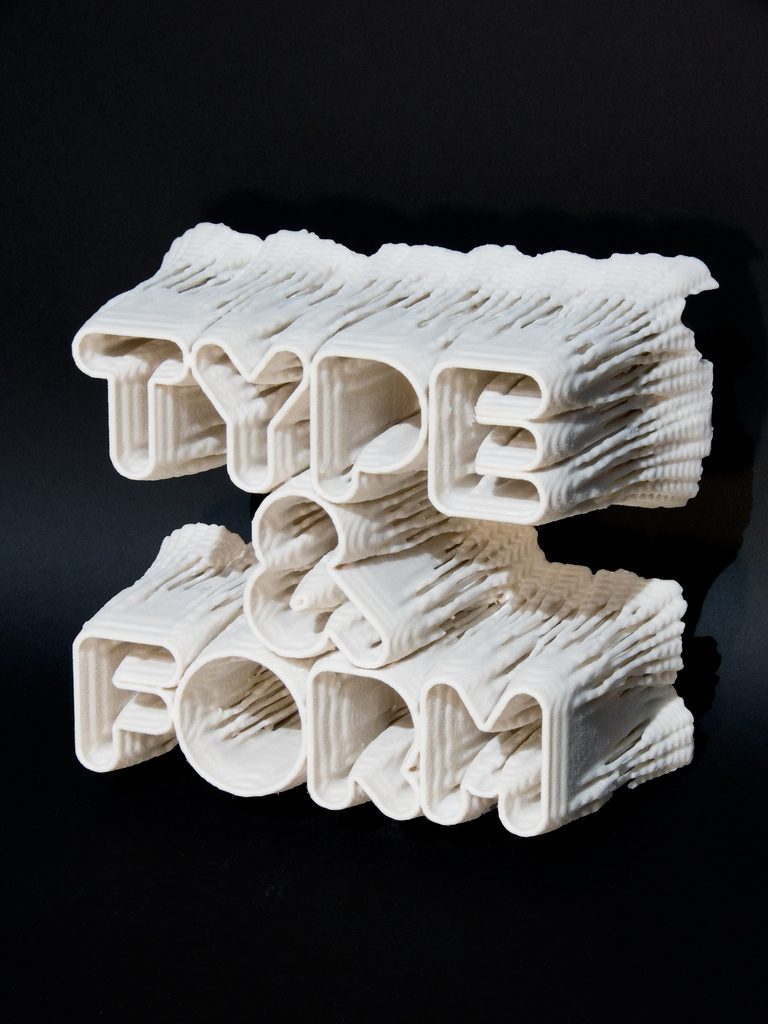
The 2009 Post-Spectacular Type & Form cover for Print magazine was grown generatively using a diffusion model. No typeface is involved. Pixels migrate into and populate rough letterform masks. 2D slices were combined to form a 3D volume using techniques borrowed from MRI data scanning. The final result is output from a 3D printer. This is incunabula of the digital age.
Is it only typography? But is that all it is? Is it only typography? If so, then why consider it here in an essay devoted to digital poetry? As noted previously, Gomringer prophetically worried that concrete poetry might someday degrade into “…an empty entertainment for the typographer” (Solt 10).Solt, Mary Ellen. 1969. Concrete Poetry; a World View. Bloomington: Indiana University Press. Type & Form might seem at first glance to be vulnerable to such a critique: lacking in direct references to either human experience or organic nature, it can be interpreted as a superficial design exercise. Superfluous technology applied without concern for deeper resonance. Yet, I think an alternative interpretation is equally valid.
Type & Form operates at a physical level as the preliminary extrusion of a computational and poetic use of materials that forces us to question our relation to language as mediated entity. Granted it is a static fossil for now, but future descendants will be kinetic. Borrowing algorithms of fluid diffusion that mimic the flow of blood or estuaries to develop its form (mathematics as meaning generation), superimposing complex layers (ambiguity and/or the classic striated onion of literary studies), extruding data into brittle stone (inverse Frankenstein), Type & Form contains within its developmental process all the crucial vectors of modernity. Linear flat paper poems become architectural nodes.
But, a critic might point out accurately, “Karsten Schmidt does not even identify as a poet; he identifies as a programmer and designer. Perhaps as often happens in ideological tug of wars he is being used to make a point.” This is true: he does probably not even conceive of his work as a poem. Yet, in 1953, one of the founding members of the Noigandres movement, Décio Pignatari was a designer; he did not identify as a poet. Type & Form (perhaps inadvertently) echoes numerous concrete manifestoes which repeatedly stress that form = content / content = form (Solt). The links between this block of minimalist type and visual minimalist structural and semiotic poems are far from tenuous.
The cultural and technological contexts of its creation suggest other implications. 3D printers are the same price now that the Apple laser printer was in 1985Printer source data: http://blog.ponoko.com/2008/10/28/desktop-factories-in-every-classroom-business-and-home/. Extrapolation: 3D printing will permit the evolution of printing language that contains kinetic functionality and eventually proto-intentionality.; they may soon be in every affluent home. Even poets will eventually own them.
Type & Form may well be the preliminary fingernail of what will eventually become a body of work - poems made out of matter, machinic-moulded poems carved on computers that will eventually contain actuators and metabolisms. Type & Form connects the clay-finger-stick origins of language to the tradition of concrete poetry.
Motion Graphics & Mammalian Malleability
One dilemma for digital poetry is that the craft and technical process of skills involved in 3D typography exceed the capacity of many poets. The visual dexterity exhibited in the commercial domain (by gifted young auto-didact practitioners such as Theo AartsmaTheo Aartsma portfolio: http://cargocollective.com/theoaartsma) creates an aesthetic difficult to duplicate and intimately linked to branding. The majority of poets (instilled with anti-commercial sentiments, Wittgenstein adage’s and residual concerns for soul) glide in the opposite direction: lo-tech, conceptual, and austere.
Trademarked Typography. The “strictness” of Gomringer (Solt 8) in his adherence to the principle of the concrete poem as just language has resulted in a landscape where digital and malleable typographic examples are to a great degree trademarked. Popular tradition and poetic tradition have diverged widely. The affect previously aspired to by romantic poets is denigrated as a preliminary step on the path toward a poetics centered on language. And it is for this reason that visual poetics, and specifically digital visual poetics, navigates a precarious path between style and substance. Advertising’s voracious embrace of adversarial aesthetics (such as graffiti tags or steampunk as in the Aartsma example above) have essentially colonized various paths of poetic development.
The challenge is to reinvigorate and re-appropriate what has already been appropriated in ways that retain integrity. The other challenge is technical and will resolve in two ways: a new generation of geek-poets, and software that demands less learning time of its user. Both are arising.
Hacktivist Typography: Eyewriter
Graffiti Typography. Even as it hurtles forward, much commercial and volumetric typography owes a lot to the past, to graffiti and tag styles which in turn are indebted to illuminated manuscripts, Elizabethan burlesque ads, archaic snuff/cigarette boxes and later Walt Disney. Letters that walk and roil with sinuous spines in thick shadowed acrobatic contortions exist somehow in between stasis and animation, legibility (legality) and illegibility (illegality). Oscillatory typographic creatures presence thick pop culture.
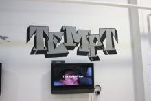
Graffiti nourishes contemporary dimensional text evolution. Because of the adversarial culture in which it evolved, many graffiti artists (i.e. visual poets of dimensional gestural type) have come and gone without any recognition at all, writing their works on alley walls, freight cars, secluded doorways and under bridges. In those specific ecosystems, visual language has become a dense delirious hallucinatory rebellion. Statement of identity, sharpies pee point scroll work, industrial interior deco, toxic spray effluence of intricate creativity.
In 2009, members of Free Art and Technology (FAT), Open Frameworks, the Graffiti Research Lab, and The Ebeling Group communities teamed-up with a graffiti writer named TEMPTONE. Tempt is paralyzed due to ALS. The team developed a prosthetic Eyewriter to allow him to tag using movements of his eyes. Prosthetic remote projectors wrote in real-time his ocular gestures onto walls.
Eyewriter marks, as far as I know, one of the first remote signatures written with light onto a building using only eye gestures. With this language escapes the box of its traditional inscription limits and moves more proximal to the mind, even as gaze becomes capable of entering into a more intimate subtle relationship with letterform: interiority as interactivity.
Ads as Tech Ops Typography. It may seem obscene to move from altruistic activism to advertisements, and even more obscene to cite ads as poetry, but that is our next step. In a culture where rampant consumption threatens the material substrate of existence for the species, ads openly fuel addictive greed, amplifying the innate seek reflex. Yet, ethics and planetary considerations aside, ads continue to exemplify the cutting edge of what kinetic visual malleable text is becoming. Video bumpers and channel idents advance the technical edge of typographic motion-graphics. Merch placement logos for toddlers, tweeners and seniors evolve the state-of-the-art rapidly in a competitive system of software upgrades and corporate budgets.
Ads are (unwitting) construction workers, building templates, exploring techniques and establishing ways that data, visuals, audio, interactivity and letterforms fuse to ensure semantic impact. Ads, in addition to this technical function, share with poetry succinctness – the swift, rhythmic and judicious use of text. This constrained use of text (twittered slogan/logo aphorisms of temporally constrained-screen-dwellers cyber-haiku) corresponds to poetic constraint. Minimal means; maximal efficiency; a high information to noise ratio; small packets, dense msg, small minds, 30 secs, 15 secs, 5 secs, logo, cut. In ads, language bounces, sweats, crumbles, swarms and collapses like an affection-deprived cockroach. Improbably, these are the technical grounds on which 21st century visual poetics will grow: from polemical sales-pitches to poem pets to poem spimes (spoems : poems that operate as quasi-aware objects).
A Hypothetical Letter-Object
Emergent properties arise when critical mass thresholds breach. Language art might be approaching a threshold that is physical (as in Jenny Holzer’s installations), quasi-organic (as in Lorenzo Oggiano’s quasi-objects), and database generative (as in Zeitguised techniques). These vectors converge from high art, AI, and motion graphics. The transformative potential of digital media operates at the interstice of disciplines.
Oggiano **Holzer Zeitguised.**Lorenzo Oggiano’s Quasi-Objects (2003-) are time-based sculptural quasi-object videos which derive their existential complexity from code. For Lorenzo Oggiano: “Life is a real and autonomous process independent from any specific manifestation.”Oggiano’s words (retrieved from online at http://www.lorenzooggiano.net/ Nov. 2010) echo the view of a cognitive science school of thought called functionalism whose primary proponent Jerry Fodor espoused a form of multiple realizability: the notion that cognition could take root in any particular substrate whatsoever. Oggiano makes morph objects generated entirely in cgi, responsive blob organisms that bloom to glitch soundtracks. Oggiano grows his video quasi-objects from state machines following laminar Perlin-speckled L-system entrails. Lichen or algae filled tidal pools with shallow depth-of-field and glitch audio synchronous with spatial change. These are Phong-gleaming abstract sculptures adrift in particle soup.
Imagine that in some hypothetical thread of the multiverse, quasi-objects fuse with real sculpted letterform objects. In that hypothetical future, Jenny Holzer will be recognized as a key figure in the evolution of dimensional poetic objects. Her Times-Square-style interventions sprout as LED curves from walls or wash over floors in waves. Her constrained immediately-identifiable aesthetic navigates a tension between propaganda and intimacy. By extruding language in retro tech (LED low-resolution displays) Holzer plays with advertising’s narcissist chase after the next and newest, subverting its presence by postulating a world where words flow as ubiquitously and visibly as a (toxic?) rain. Imagine Oggiano’s quasi-objects made physical letterformsModelers now model physical things in computation, but if/as robotic sculpture grows, these models will be recycled to control the movements of physical objects. There is a strange recursion to the process. from which Holzer made installations out of metamorphic alloys, and you have probably imagined a shot with similarities to a Zeitguised video. In a Zeitguised video 3D models harvested from public warehouses are sliced into existence, shredded as glitch shrugging into skins, to reveal “that the merging nano-, bio-, and information technologies have rendered the concept of human authenticity and originality obsolete, that artificial materials create their own artifacts and their future shape.”Zeitguised is a motion graphics design group in Berlin directed by Henrik Mauler. http://zeitguised.wordpress.com/2004/05/24/the-zoo/
In a hybrid hypothetical future, letterforms physicalize, enhanced with digital meta-data, their embodied entity-status preceded by many generations of living in close symbiotic contact with images.
1.2 Conjunctions
On The Path to Embodied Letterforms
“Convergence … results in conditions proportionally able to undermine the expressive distinctness that separates art and literature.” - Francisco J. Ricardo (Literary Art in Digital Performance 1)
No process is immediate; few assimilations are total. However, in some digital environments, images are in the process of assimilating text.This idea Is not new, it frames digital literature. Bertrand Gervias uses the term subsumed to express the same recognition: “…the texts that constitute it are initially perceived as images, animated metaphors or visual texts. The texts and documents become images, they no longer read [sic], they are to be seen: their linguistic dimension has been subsumed under their iconic function.” On http://aierti-iawis-2011.uqam.ca/esth-tiques-num-riques-digital-aesthetics Gervais has been using this term for years (conversation with author). As with social assimilations, this abstract assimilation is not without controversy. The normal popular view is that words and images are distinct and should remain that way.
**The Normal View.**The normal view is easily found; a typical example is expressed in the November 18th 2010 London Review of Books by Peter Campbell “… images tend to drown out words. Why not let them? Well, words and images need different kinds of attention. Words tend to reduce pictures to illustrations, pictures to reduce texts to captions.” In this view, conjunctions lead to reductions, disruptions and ruptures in concentrative force.
Where purists see antagonistic competition, I see opportunities for synergy: combined word, sound, and image creating greater throughput.
Instead of trying to battle the advocates of image-text segregation head-on, I will offer a history of image-text evolution.As I chart the text/image that is at the core of digital poetry, I am indebted to W J T Mitchell’s Picture Theory. Many of the ideas and modes of discursive approach that follow were provoked by his eloquent and vigorous discourse. It offers a proof by continuity that text is being assimilated into imagery, reading is fusing with viewing, and that synaesthesia may become as normal as literacy. If we assume evolution tends toward optimization, this suggests that image-texts are more potent (as visual-literature) than text or image alone. And it is not a sterilized monoculture of corporate creativity that will ensure all text corresponds to imagistic protocols. Instead it is as Manovich states, that the ensuing result of convergence or assimilation (or whatever terminology is usedManovich would not agree with the terms convergence or assimilation: “In my view, it does not imply that the different media necessarily fuse together, or make up a new single hybrid, or result in “multimedia,” “intermedia,” “convergence,” or a totalizing Gesamtskunstwerk. As I have argued, rather than collapsing into a single entity, different media (i.e., different techniques, data formats, data sources and working methods) start interacting producing a large number of hybrids, or new ‘media species.’” (pg. 189)) will be “more species rather than less” (184), more divergence.
It is also not that text is eradicated as a simple 2D monochromatic entity; instead it is that print in static form becomes part of a larger continuum, an explosive gathering of text-image-audio tavit entities that arise at the confluence of hybrid media and increased computational power. And these tavits, instead of being at the periphery of culture, will be at the centre in ads, film credits, music videos, experimental videos, and other pop culture.
**On Co-evolution.**Visual poetry in this evolving ecosystem is just one species among many that is being digitized. As Christopher Funkhouser wrote in 2007: “Poetry as it is known historically will never completely change into a digital form; it will continue to exist as it has – as myriad spoken, written, and other textual formulations alongside computerized counterparts” (251).
There are several ways image/texts occur on the path toward the assimilation of text by image. The first and simplest is a label or caption. On the cave wall, there is a scratched glyph near a smeared figure. Both picture and text inhabit distinct worlds. There is no visual overlap. Reading and viewing are activated separately. But already there is a symbiosis. As reading-viewing oscillate, a meaning emerges that is the product of the two activities.
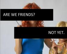 The corollary of the caption is text overlay. In overlay, text juts out a pier of translucent or opaque colour. Text appears above the ground of the page it paves over image. The text’s world (the printed page) protrudes unapologetically into the world of the image. An oscillation between reading and viewing occurs; the text makes no concessions to imagistic style; each remains separate even though superimposed. In fact, the text’s background ignores and occludes the image. Text in this scenario is antagonist to viewing of the image as a whole. It breaks the frame and obscures a segment. The overlay-with-background is implicitly hierarchical, privileging the language act. Explicative process trumps integrative absorption. At a very rough level of granularity, this layout reflects the widely held bias of logic over sensuality. As the text works to make the image comprehensible, it becomes the context.
The next step in the evolution of text-image toward symbiotic fusion is popularly referred to as word-art.In most writing softwares, a little add-on package allows words to be bent or moved. This became widely available around 1990 when it was incorporated into MS Word 3.0. (Source: Wikipedia correlated word-art with ms word entry)  When text as image discards the image entirely by becoming it, representative or mimetic functions are subsumed by the placement of words.
Apollinaire is the obvious progenitor of this branch. His calligrames precipitate concrete poetry up into language sculpture. Steve McCaffery exemplified this tradition in Canada in the 1960s with an art-brut intellectual perspective. And idiosyncratic commercial-art practitioner Robert Bowen TextScapes uses a similar approach when he wraps landscapes in text. Camille Utterback’s iconic TextRain is another example of “that tradition where the text is the image and vice versa, so that neither is fully itself autonomously, separately, individually” (Ricardo, pg. 76).
It is intriguing to note how Francisco Ricardo opens his treatment of TextRain by examining how the advocates of “pure literature” exiled images from literary texts; the expulsion used a litany of doctrinal objections against the integration of imagistic content perceived as hostile to literature’s essence (pg 54-56). Against such critiques, Ricardo explores how the effect of TextRain is “transmodal, a recursive amalgam of filmic, literary, performative and near-sculptural conditions” (60). It is within the ideologically hostile environment outlined by Ricardo that text and image establish illicit yet fertile contact. With digital imaging techniques, the porosity between text and image increases.
Eventually, after some time as with most couples, they move in together. In the previous case of text-as-image, text imagined itself as image; in the next case, text inhabits image and the idea of image-as-habitat emerges. Text sits on top of image, still occluding it perhaps, but it has left behind its clothing (the page).
**The Layover.**This is the first evolutionary contact between text/image; they now inhabit the same field. Each remains distinct; they are like shy strangers at a party standing in proximal intimacy but not speaking much to each other. Many ads use this formula. A photo with a logo superimposed.
In other cases, text begins to assume qualities of the image. The font will be chosen to reflect the scene; the predominant colour of the image may be inverted and assigned as font colour; the text position may be set to correspond with a sharp edge, a horizon or table. Essentially a process of assimilation occurs through concessions as features associated with things are implemented textually.
There is also the opposite motion, visual use of ascii text to reconstruct an image using grayscale values. Ascii portraiture’s resonates with the thematic of mediated DNA civilization paradigmatic axioms: We are all code. Languaged DNA dancing. An aesthetically appealing (and conceptually nuanced) example is Camille Utterback’s Written Forms(200) which later got incorporated into Talking Cure (in collaboration with Noah Wardrip-Fruin). In these projects the otherness of the image/text, the way text distorts reality, emphasizes the foreignness of the subconscious and proposes an ergodic reading environment.Interesting tangential note is that Wardrip-Fruin anticipated contemplative reading being elicited, and in fact playful collaborative patterns emerged. (Expressive Processing. p. 365). In ascii portraits, image and text have fused but in a power relationship much like détente; both are readable in constrained ways, in paralysis rather than synergy.
So what is assimilation? Does it occur when the oscillatory fluctuations between reading and viewing occur so swiftly that they are quantitatively imperceptible (merging into apparent concurrency)? Is there a cognitive mode that occurs when text/image is read in parallel, when the impact of visual and verbal wash up on the shore of consciousness simultaneously?
On the Necessity of Metaphors. Metaphors are necessitated because there is no neurological lab or equipment capable of measuring the subtle flux and flow of meanings that arise and subside as the eyes wander, saccade, absorb focally and peripherally, both text and imagistic data.
Synergetic fusion occurs when the naturalistic aspect of the text (colour tones, light, shadows, textures, quality) matches that of the image. On the path to that equal potency, text needs a body and a substrate to rest on.
*Early 3D: Vallias & Kac.Both the body and substrate emerge in experiments in 3D poetic language conducted by pioneers such as Eduardo Kac and André Vallias. Kacs ***OCO*** (1985/90. In Kac pg. 53) is a rough set of donut-style letterforms: O-C-O forming a cylinder. No textures, no phong or raytracing, not much by contemporary CGI standards, but a step toward the development of a dimensional body for letterform in literary milieu. Vallias' ***Nous navons pas compris Descartes(1990.In Kac. pg. 88) does something he perhaps had not intended, it translates Olson’s field theory into 3D form, while The Verse (1991. In Kac p. 88) introduces poetic meter rendered in wireframe. The Verse looks like an information visualization of a poet’s breath, a spoken word oscilloscope. So the body and territory (the tav and tavt) converge at the point where it is the body that produces the form on which the words rest, so even in their absence something is spoken.
Visual Language: Volumetric and Situated
“…visual form does something, rather than that it is something.” Johanna Drucker (SpecLab, Pg.75, emphasis in original).
Consider text on a flat page. If printed on a press, the text is indented almost imperceptibly. The ink has bonded with the paper, the fibres of the paper have soaked up the stain of the letter, paper and letter are materially bonded, melded together. On screens, there is no indentation of ink into paper. Pixels portray depth through a luminous two-dimensional perspectival grid.
**On Persistence.**Due to the persistence of iconographic traditions of print, most digital text appears as if printed. To a casual eye, the similarities between the trace mark-making of petroglyphs, papyrus, hieroglyphs, and screen-based digital typography are strong. Line based, left to right reading, columns with headlines, formatting (upper case, sentences, underlines, italics and justification): these formal elements of writing persevere through technologies. Writing remains what it always was, a reservoir of prescriptive grammatical rules, typographic traditions, and literary effects. There are few attempts to make strangeMaking strange is a feature of the literary according to early 20th century Russian formalists. with what is overly familiar.
Now imagine blisters arising in the form of letters on the printed page. The dormant immobile ink of each letter bubbles upward just slightly. The indentation of the printing press is inverted. The letters hover like pimples, swollen with ink, foaming over. They shine as if plastic; they gleam as if wet. The page is now implicitly tactile.
**On Braille.**The blister metaphor references Braille. It is now possible to conceive of someone touching the page and slowly (laboriously) reading it with their fingers. Unfortunately, if this imagined page occurs on a contemporary screen, then its depth is implicit, it cannot be touched. Tactility is offered then denied. This absence of techno tactility (even in the multi-touch swipe-screen era) is a common critique of digital media; yet, paradoxically, to its credit, the screen offers many illusions of tactility and three-dimensional space in a way that the printed page never did. The tactile nostalgia referenced by printophiles is (like much nostalgia) operating at the level of mythology: books by their weight and density convey a presence nourished by traditions. Books, by their texture, place what is read within a canon.
As generations change, however, so too will the mythological status of tablets, cellphones and e-readers; devices will saturate in the memory of being held and read. That which has been treasured and held in the mind gains a tacit tactility; intimate, remembered words evoke identity.
Return to the imagined blistering text, imagine more, imagine that the letter-blisters grow pronounced as pimples, swollen with pulsating slushy ink; each letter now germinates and extrudes like a sprout; sexual, a thick fountain, a forest of letters, a field of wavering black stalks rises off the page; each is plush with a pulsing succulent interiority. Our viewpoint shifts, we rush over a thriving field of grown language, as if we were a bird or a low-flying plane, we rush over a field of wind-struck writhing letters raising their heads to the sun, following the reader.
It is all possible with CGI. It has already been done in a few commercials. Andreas Muller’s For All Seasons already replicates most (if not more) aspects of the preceding experience, and gives the reader-viewer interactive control. Text as field, immersive, tacitly tactile, already exists. Four years ago, Muller began working on a project to give computers the capacity to dream about flowers.http://www.hahakid.net/forallseasons/forallseasons.html and http://www.vimeo.com/776076 And as Rita Raley points out, Jeffrey Shaw’s The Legible City (1989-91) and Matthew Kirschenbaum’s Lucid Mapping project (1997-98) both predate the emergence of many other projects concerning 3D space writing. Rita Raley: “Concrete poetry brought the critical importance of the three-dimensional language object to the fore in its exploration of the positioning of words on a surface. … It is here that claims for a phenomenologically new mode of reading are best actualized; pointing towards what may well be one of the future trajectories of reading itself.”http://iowareview.uiowa.edu/TIRW/TIRW\_Archive/september06/raley/editorsintro.html
1.3 Summary
To summarize, two fundamental steps occur when digital text is made malleable. The first step is it becomes volumetric (the planar surface of two dimensions enters into three; the field sprouts). Another step occurs when the text is placed, composited and rendered into a video environment. (The viewpoint shifts, letters become objects placed and lit within a field).
The reader may experience this shift as the emergence of both space and a sense of the eye as camera, the view (becomes?) embodied. The first step induces a sense of text as palpable, it implies tactility. The second step invokes a sense of existence, text leaps beyond a gap, it enters into the hermeneutics of existence.
Works Cited
Abbink, J. (2010). 3D Typography (1st ed.). New York: Mark Batty.
Ackerman, J. M., Nocera, C. ., & Bargh, J. A. (2010). Incidental haptic sensations influence social judgments. Science, 328, 1712-1715.
Amerika, M. (2007). Meta/data: A Digital Poetics. Cambridge, MA: MIT Press.
Ampex. (n.d.). Retrieved from http://www.velocite.net/lobby.html
Bachelard, G. (1969). The Poetics of Space. Boston: Beacon Press.
Ball, R. (2008). Oldest Animation. Animation Magazine.
Beiguelman, G. (2010). “Qartcode: A Statement: Mobile tagging: nomadic writing for expanded reading.” Emerging Language Practices, (1).
Bellantoni, J. (2000). Type in Motion: Innovations in Digital Graphics (1st ed.). London: Thames & Hudson.
Berger, J. (1980). About Looking. London: Writers and Readers.
Bettelheim, B. (1989). The Uses of Enchantment: The Meaning and Importance of Fairy Tales. New York: Knopf : distributed by Random House.
Blanchot, M. (1982). The Space of Literature. Lincoln: University of Nebraska Press.
Bolter, J. David. (2001). Writing Space: Computers, Hypertext, and the Remediation of Print (2nd ed.). Mahwah, N.J: Lawrence Erlbaum Associates.
Bolter, Jay David. (2002). Turing’s Man. Scholarly Book Services Inc.
Born Magazine: Art and Literature Collaboration. (n.d.). Retrieved March 9, 2009, from http://www.bornmagazine.org/
Bringhurst, R. (2006). The Tree of Meaning: Thirteen Talks. Kentville, N.S: Gaspereau Press.
Cambell, P. (2010). “On Radio 4.” London Review of Books, 32(22).
Campos, H. de, & Jon M. Tolman. (1982). “The Informational Temperature of the Text.” Poetics Today, 3(3), 177-187. doi:10.2307/1772397
Cayley, J. (2005). Writing on Complex Surfaces. Retrieved March 13, 2009, from http://www.brown.edu/Research/dichtung-digital/2005/2/Cayley/index.htm
Child, A. (2005). This Is Called Moving: A Critical Poetics of Film. Modern and contemporary poetics. Tuscaloosa: University of Alabama Press.
Cho, P. (1999). Computational Models for Expressive Dimensional Typography (Thesis. MA. MIT.). Retrieved from http://acg.media.mit.edu/people/pcho/thesis/pchothesis.pdf
Cholodenko, A. (Ed.). (1991). The Illusion of Life: Essays on Animation. Sydney: Power Publications in association with the Australian Film Commission.
Clarke, E., Reichard, U. H., & Zuberbühler, K. (2006). The Syntax and Meaning of Wild Gibbon Songs. PLoS ONE, 1(1), e73. doi:10.1371/journal.pone.
Cramer, F. (2004). Words made flesh. Code, Culture, Imagination. Media Design Research, Piet Zwart Institute. Retrieved fromhttp://www.netzliteratur.net/cramer/wordsmadefleshpdf.pdf
Dan Waber, & Jason Pimble. (n.d.). I, You, We. Retrieved February 9, 2011, from http://collection.eliterature.org/1/works/waber_pimble__i_you_we.html
Douglass, J., Marino, M., & Pressman, J. (2010). Close-Reading Code, Content, and Cartographies in William Poundstone’s “Project for the Tachistoscope: [Bottomless Pit].” ELO “Archive & Innovate” Conference Presentation.
Drucker, J. (1994). The Visible Word: Experimental Typography and Modern Art,1909-1923. Chicago: University of Chicago Press.
Drucker, J. (1998). Figuring the Word: Essays on Books, Writing, and Visual Poetics. New York, N.Y: Granary Books.
Drucker, J. (2009). SpecLab: Digital Aesthetics and Projects in Speculative Computing. Chicago: University of Chicago Press.
Dunbar, R. I. M. (1996). Grooming, Gossip, and the Evolution of Language. Cambridge, Ma: Harvard University Press.
Dutton, P. (n.d.). Persistent Pattern. Rampike, 6(3), 83-84.
Dworkin, C., & Goldsmith, K. (2011). Against Expression: An Anthology of Conceptual Writing. Northwestern University Press.
Engberg, M. (n.d.). Born Digital: Writing Poetry in the Age of New Media.
Fry, B. (2000). tendril. Retrieved November 25, 2010, from http://benfry.com/tendril/
Fuller, M. (Ed.). (2008). Software Studies: A Lexicon. Cambridge, MA: MIT Press.
Funkhouser, C., & Funkhouser, C. T. (2007). Prehistoric Digital Poetry: An Archaeology of Forms. University Alabama Press.
Geoffrey Hlibchuk. (2010). From Typology to Topology: On Jack Spicer. Contemporary Literature, 51(2), 310-340.
Gerritzen, M., Lovink, G., & Kampman, M. (2011). I Read Where I Am: Exploring New Information Cultures. Valiz.
Glazier, L. P. (2002). Digital poetics : the making of E-poetries. Tuscaloosa, Ala.: the University of Alabama Press.
Gromala, D. (2000). BioMorphic Typography. Retrieved September 20, 2011, from http://www.lcc.gatech.edu/~gromala/art.htm
Harman, G. (2010). Towards Speculative Realism: Essays and Lectures. Zero Books.
Hartman, C. O. (1996). Virtual Muse: Experiments in Computer Poetry. University Press of New England.
Higgins, D. (1987). Pattern Poetry: Guide to an Unknown Literature. Albany: State University of New York Press.
Hutchinson, B. (2006). Rilke’s Poetics of Becoming. London, UK: Legenda.
Innis, H. A. (2007). Empire and Communications. Dundurn Press.
James, W. (1976). Essays in Radical Empiricism. Cambridge: Harvard University Press.
Kac, E. (1986). Holopoetry and Perceptual Syntax. Holosphere, 14(3), 25.
Kac, E. (2007). Media Poetry: An International Anthology (illustrated edition.). Intellect Ltd.
Kallir, A. (1961). Sign and Design. The Psychogenetic Source of the Alphabet (First Edition.). Vernum.
Kelly, K. (2010). What Technology Wants. Viking USA.
Knuth, D. E. (1999). Digital Typography. CSLI lecture notes. Stanford, Calif: CSLI Publications.
Köhler, W. (1929). Gestalt Psychology. New York: H. Liveright.
Krauss.pdf. (n.d.). Retrieved from http://www.situations.org.uk/_uploaded_pdfs/Krauss.pdf
Kristeva, J. (2002). The Portable Kristeva. European perspectives (Updated ed.). New York: Columbia University Press.
Lanham, R. A. (1995). The Electronic Word: Democracy, Technology, and the Arts (1st ed.). University Of Chicago Press.
Laurel, B. (n.d.). Designed Animism. Retrieved February 17, 2011, from http://www.tauzero.com/Brenda_Laurel/DesignedAnimism/DesignedAnimism.html Le spatialisme poésie visuelle - Pierre et Ilse Garnier. (n.d.). Retrieved December 14, 2010, from http://crdp.ac-amiens.fr/garnier/article21.html
Lehman, M. M., & Belady, L. A. (1985). Program Evolution - Processes of Software Change. APIC Sudies in Data Processing No. 27. Academic, Press.
Lorenzo Oggiano. (2006). Quasi-Objects / Cinematic N.07. Vimeo. Retrieved November 28, 2010, from http://vimeo.com/15661174
Manovich, L. (2012). Software Takes Command ((2008 Draft).). http://lab.softwarestudies.com/2008/11/softbook.html: MIT Press.
Margulis, L. (1988). Five Kingdoms: An Illustrated Guide to the Phyla of Lifeon Earth (2nd ed.). New York: W.H. Freeman.
Marino, M. C. (2010, September 15). “Critical Code Studies and the electronic book review: An Introduction.” EBR : Electronic Book Review. Retrieved September 20, 2011, from http://www.electronicbookreview.com/thread/firstperson/ningislanded
Matthew G. Kirschenbaum. (1997, 98). Lucid Mapping and Codex Transformissions in the Z-Buffer. Retrieved February 9, 2011, fromhttp://www2.iath.virginia.edu/mgk3k/lucid/
Mauler, H. (2004). The Zoo « ZEITGUISED. Retrieved September 20, 2011, from http://zeitguised.wordpress.com/2004/05/24/the-zoo/
Merleau-Ponty, M. (1962). Phenomenology of Perception. New York: Humanities Press.
Mitchell, W. J. T. (1995). Picture Theory: Essays on Verbal and Visual Representation (1st ed.). University Of Chicago Press.
Mitchell, W. J. T., & Hansen, M. B. N. (Eds.). (2010). Critical Terms for Media Studies. Chicago, IL: University of Chicago Press.
Miller, J. A. (1996). Dimensional Typography. Princeton Architectural Press.
Morris, A. K., & Swiss, T. (2006). New media poetics : contexts, technotexts and theories. Cambridge, Mass.: MIT Press.
Müller, A. (2005). For All Seasons. Retrieved June 11, 2007, from http://www.hahakid.net/forallseasons/forallseasons.html
Oggiano, L. (2008). Quasi-Objects. Retrieved May 6, 2009, from http://www.lorenzooggiano.net/
Ong, W. J. (1982). Orality and Literacy: The Technologizing of the Word. London: Methuen.
Panskepp, J. (1998). Affective Neuroscience: The Foundations of Human and Animal Emotions. Series in affective science. New York: Oxford University Press.
Perloff, M. (1991). Radical Artifice: Writing Poetry in the Age of Media. Chicago: University of Chicago Press.
Pierce, D. (n.d.). The Hedonistic Imperative. Retrieved November 14, 2010, from http://www.hedweb.com/
Pinker, S. (1994). The Language Instinct (1st ed.). New York: W. Morrow and Co.
Ramachandran, V., & Hubbard, E. (2001). “Synaesthesia — A window into perception, thought and language.” Journal of Consciousness Studies, 8(12), 34, 3.
Ricardo. (2009). Literary Art in Digital Performance: Case Studies in New Media Art and Criticism. Continuum.
Rita Raley. (2006, September). Writing 3D : Special Issue of Iowa Review. Retrieved February 9, 2011, from http://iowareview.uiowa.edu/TIRW/TIRW_Archive/september06/sept06_txt.html#
Sampson, G., Gil, D., & Trudgill, P. (Eds.). (2009). Language Complexity as an Evolving Variable. Oxford: Oxford University Press.
Schmidt, K. (2008). Type & Form. Retrieved January 4, 2009, from http://postspectacular.com/process/20080702_printmagcover?s=type%20form
Skrbina, D. (2005). Panpsychism in the West. Cambridge, Mass: MIT Press.
Smith, H. (2009). Practice-led Research, Research-led Practice in the Creative Arts. Edinburgh University Press.
Solt, M. E. (1969). Concrete Poetry; a World View. Bloomington: Indiana University Press.
Sporns, O. (2010). Networks of the Brain (1st ed.). The MIT Press.
Stefans, B. K. (2011, January 11). “Language as Gameplay: From The Oulipo to the Jew’s Daughter.” Retrieved January 22, 2011, from http://netpoetic.com/2011/01/language-as-gameplay-from-the-oulipo-to-the-jews-daughte/#more-1967
Strickland, S., & Jaramillo, C. L. (2005). Dovetailing Details Fly Apart – All Over, All Again, In Code, In Poetry, In Chreods. Retrieved July 25, 2007, from http://www.slippingglimpse.org/pocode
Suchman, L. A. (2007). Human-Machine Reconfigurations: Plans and Situated Actions (2nd ed.). New York: Cambridge University Press.
TEMPTONE, Free Art & Technology, Open Frameworks, Graffiti Research Lab, & Ebeling Group. (2009). EyeWriter Initiative. Retrieved December 20, 2009, from http://www.eyewriter.org/
Thacker, E. (2007). “Biopoetics; or, a Pilot Plan for a Concrete Poetry -.” electronicbookreview.com -. Retrieved March 23, 2011, from http://www.electronicbookreview.com/thread/electropoetics/emerging?mode=print The Illusion of Life II: More Essays on Animation. (2007). [Sydney] N.S.W., Australia: Power Publications.
Thompson, E. (2007). Mind in Life: Biology, Phenomenology, and the Sciences of Mind. Cambridge, Mass: Belknap Press of Harvard University Press.
Wardrip-Fruin, N. (2009). Expressive Processing: Digital Fictions, Computer Games,and Software Studies. Cambridge, Mass: MIT Press.
William Gillespie. (n.d.). “Word Museum.” Retrieved February 9, 2011, from http://iowareview.uiowa.edu/TIRW/TIRW_Archive/september06/gillespie/wordmuseum.html
Williams, S. (2002, April 8). “A unified theory of software evolution.” Salon. Retrieved December 1, 2010, from http://dir.salon.com/story/tech/feature/2002/04/08/lehman/
Willis, H. (2005). New digital cinema: reinventing the moving image. Wallflower Press.
Yang, S., Zhou, K., Kreit, E., & Heikenfeld, J. (2010). “High reflectivity electrofluidic pixels with zero-power grayscale operation.” Applied Physics Letters, 97(14), 143501. doi:10.1063/1.3494552
Youngblood, G. (1970). Expanded Cinema ([1st ed.]. —.). New York: Dutton
Note: This essay was commissioned by EBR editor Davin Heckman, and was extracted from Jhave’s thesis.
Cite this article
Johnston, David (Jhave). "The Assimilation of Text by Image" electronic book review, 7 October 2012, https://electronicbookreview.com/publications/the-assimilation-of-text-by-image/

