Reconfiguring Flatness on Screen: A Short History of Cover Designs for Chinese Web Novels

Renren Yang insightfully reveals the rarely (if ever) explored domain of cover designs for Chinese Web novels. Tracing their evolution from a print format that enables the tactile and sensual pleasures of opening the actual book to its supposedly more immaterial digital incarnation, Yang reimagines the very idea of a book cover in the digital age. This closer look reveals how serialized novels’ cover design frames the reader's experience, demonstrating as well the fact that the already well established periodization of the First, Second, and Third Generation e-literature are culturally and geographically specific, and dependent on the local histories of computing technology beyond Euro-American context. Analyzing the conceptual tension and fusion between book cover as a “mixed medium” and digital cover as “intermedium,” and drawing upon Chinese pictorial tradition, Yang defines the ontology of the digital book cover as an attempt at reconfiguring “flatness” on the digital screen.
Hardly any readers of Chinese Web novel would pay much attention to the “cover” for the serial narrative they are fervently pursuing. This is not surprising, given that the book design and Web design are converging in the digital age (Mod); moreover, it is the serial design of the narrative and the platform that compels a reader’s return to the novel.1 Indeed, if the book is disappearing into the Web, what is the point of salvaging a book cover for a Web novel? If the Web novel, as a branch of e-literature, is essentially “a writing-centered art” that explores “the expressive potential” of the Internet (Flores), wouldn’t it be more appropriate to focus on the novelist’s writing and the website architecture that facilitates their delivery? Why would a Web novel need a cover at all?
For better or worse, the room for a book cover on the Web has severely shrunk these days. As most Chinese Web novels are solely produced and consumed online, their dematerialized form obviates a material cover. Boards, slipcase, spines, end sheets, cloth textures, text block, joint and hinge, all these references to the anatomy of a physical book cannot find their counterparts in the e-book format. The book cover used to be a dust jacket that plays multiple roles, be it a protective skin, a beautiful souvenir, or a decorative object (Mendelsund 110–11); but for Web novels, the cover is reduced to a low-definition thumbnail image which has little space for the plaudits, blurb, barcode and price tag one may find on a dust jacket.
For a bibliophile, the disappearance of print cover comes at the expense of the tactile dimension of reading. As one reader reminisces, the feel of a book cover used to be an indispensable part of our reading experience: “How many of you have repeatedly closed the book you were reading in order to check out the cover and match the image in your head with the cover model? To check out the architecture or the setting or to gauge the atmosphere the illustration lends to the story?” (Little). Indeed, the feel of a book cover could energize our imagination through an alchemy of the verbal, visual, and tactile sensation. Regrettably, such flights of imagination are gone when we read on the Web. We can easily jump in and out of the Web novel with little sense of procession and ritual, not to mention any sentimental encounter with the cover. This registers an irrevocable “disintegration of the aura” (Benjamin 194) in our reading experience.
For many other readers, however, the book cover matters less than the Web architecture. Chinese literary portals provide readers with much useful information to help them pick the novel that will potentially appeal to their personal taste. First, all the novels are meticulously cataloged under different generic labels and thematic tags.2 At the same time, readers can rely on other statistics to gauge the novel’s popularity, such as weekly/monthly ratings, total subscriptions, and numbers of reader reviews. In addition, the novel’s title often betrays its diegetic “points of instant gratification” (shuangdian). This is to say, by looking at the title alone, readers can learn what types of scintillating and sensational moments they can expect from the story. For example, the novel Apocalypse of All Clans on Earth – a story about the struggle for power among numerous races and tribes in the world – was ranked top one on many popularity lists in late December 2020 at Qidian (fig.1), and if you click on its title, you will be led to its title page where you can find various labels specifying the novel’s genre (urban legend), theme (training), and central motif (rebirth); numbers of cumulative recommendation; and a list of honorary badges the writer has won (fig.2). These units of data or metadata on the webpage make any graphic illustrations and expert’s endorsements on the cover redundant. What is more, if you are on the mailing list of a fan’s club, you will receive snippet recommendations of Web novels on a regular basis. For each recommended novel, a short review of its central motif, character coupling, and potential narrative loopholes will be provided (no more than 100 words) (Gao 130). No wonder that the cover is being consigned into oblivion, and few scholars of Chinese Web novels paid attention to it.
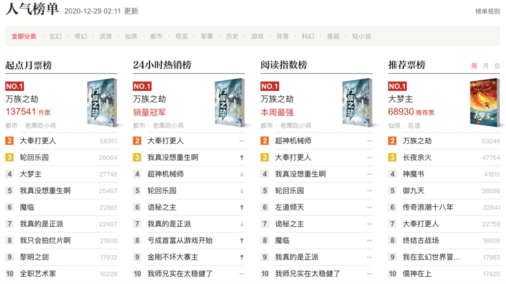
Qidian. https://www.qidian.com/rank. Accessed 29 December 2020.

Qidian. https://book.qidian.com/info/1018027842. Accessed 29 December 2020.
Although the serial novel appears to be one of the late settlers on the Chinese Web,3 the Web quickly assimilates it by erasing the material traces, social practices, and sentimental memories associated with the print book. However, Jenkins’ critique of the “Black Box Fallacy” (13–16) acts as a buffer against the myth of an all-subsuming Web: just as no single computer – the ultimate “media synthesizer and manipulator” (Manovich 26) – can displace specialized media appliances in our household, so too the e-lit carrier/deliverer cannot kill the printed page/cover. To imagine the killing of the cover by the Web is to fear shadows. The designer Craig Mod even composes a poem titled “Muerto!” to ridicule such anxiety:
The covers are dead!Dead! Dead like the record jacket! Dead like the laser disc sleeve! Dead like the 8-track cartridge sticker! Dead like the squishy Disney VHS container! Dead like the cassette tape insert! Dead like those damned CD jewel cases and their booklets! Dead like DVD and Blu-ray box art!
If the exclamations in the first two lines evince shock, anger, and bitterness, that feeling is much attenuated with “Dead like” repeated seven times in the subsequent lines. Mod uses anaphora not only to align the death of the book cover with its precedents, but also to push the irony against our self-indulgent regret, especially posterior to the continuous disappearances of one media cover after another in the past decades. As Leah Price reminds us, in 1831, people worried that the book would kill the cathedral’s architecture; in 1835, the newspaper was thought to kill the book; in 1927, television and radio were believed to end reading – “Every generation rewrites the book epitaph; all that changes is the whodunit”; but rarely could any new technology supersede the old (A30). Indeed, as we witness today, the book does not die, the novel does not disappear, and the book cover is still very much alive.
Book cover and cover design persist in the Web community. For one thing, the cover for the Web novel, though no longer offers a grab bag of information, retains the roles of an interface, an entryway and a front door between the novel and the world; a reminder and a mnemonic device when we are browsing through the titles on the Web; a teaser that gives off just enough information to entice readers; and a “Carnival Barker” which advertises the novel in all the ways possible (Mendelsund 110–11). As David J. Alworth’s suggests, the rise of multimedia ecology does not play down but rather draws attention to the importance of book covers:
As part of a media ecology that includes promotional materials, digital marketing campaigns, and in some cases television or film adaptations, book jackets make novels visible in a world where there is simply too much to see. They form a hinge not only between reality and fiction but also between literature and design, aesthetics and politics, art and life. (1124)
Digital cover design, therefore, helps us sift novels at an age of graphic overload. Furthermore, many cover designers seize on the shift to digital publishing as an opportunity to artfully juggle information within a digital thumbnail.4 They also have to work in a different time frame. Because the serialization of a Web novel may last several years, its cover image must appear long before the serial’s completion. And the digital cover design will not be a one-time deal. The size, resolution, and composition of the cover image is subject to further revisions and alternations in case of state censorship, website’s policy changes, or unexpected twists in the plot development. Cover designers must remain flexible, ready to adapt their creations to the protocols and contingencies of electronic literature.
I propose to capture the medial status of the digital book cover through Higgins’ notions of mixed media and intermedia: both involves multiple media and their difference lies in whether those media forms are conceptually fused into each other or not (Higgins 16). Book cover could be a “mixed medium” because it is executed through both graphic drawings and written words, inasmuch as we can tell apart which is the illustration, and which is the title. In the online selling space, the digital book cover becomes an “intermedium” because it falls conceptually between a book cover and a digital image, and embodies a fusion of these two. As a book cover, it is conceptually affixed to the content of the book. Like a print paratext, it “surround[s],” “extend[s],” and “present[s]” the text, in order to “ensure the text’s presence in the world, its ‘reception’ and consumption in the form (nowadays, at least) of a book” (Genette 1). However, as a digital image, it is physically dissociated with the book and enjoys its precarious autonomy to be “copied, linked, and reposted, at different resolutions and sizes” across different websites and platforms (Bridle). It is the conceptual tension and fusion between these two identities that define the ontology of the digital book cover.
In what follows, I trace the evolution of cover designs for Chinese Web novels. I use the schema of “flatness” to scaffold my deliberation, as it is the primordial material and conceptual condition for any graphic design.5 I demonstrate not only how the improvement of graphic design tools have changed the outlook of digital book covers, but also how the cover design eventually liberates itself from the print paradigm by reconfiguring “flatness” on the digital screen. Along the way, I am asking: What is the changing relationship between the title and the image on the digital book cover (as a mixed medium)? How does the digital cover image (as a paratext) formally relate to the novel’s narrative? How does the digital cover (as a separate image) avail itself of the seemingly unfettered liberty in cyberspace? And finally, what can we learn about Chinese Web novels in general from the “intermedial status” of their digital covers?
The Inherent Flat Plane
As an art object, the book cover requires a real or virtual space to display. Like a painting or drawing, the book cover frames a surface that must be recognized as a flat, rectangular, and independent field. In Chinese pictorial tradition, as Wu Hung suggests, the awareness of the flat plane emerges in medieval times, together with the appearance of portable painting, art criticism and connoisseurship (45). Wu reminds us of the anecdote of Cao Buxing, a third-century painter, who accidentally drops an ink blot onto the white silk mounted on a screen and then turns the mark into a black fly resting against the white backdrop. This creates a trompe-l’œil effect which makes Cao’s patron later mistake the image for a real insect (ibid.). This anecdote draws attention to the flat silk screen as material support for the lifelike fly-image. In Western tradition, the self-consciousness of pictorial flatness dates back to the Renaissance painting, which often signifies a tension between the spatial illusion and the presence of flatness that checks or cancels that illusion (Steinberg 14–15). Despite its potential for supporting an image with illusionist depth, the painting’s edge often recalls the flat surface of the canvas.
Likewise, the flat picture plane remains an a priori condition for any book cover design. The central challenge for designers is how to project a pictorial space onto a two-dimensional plane. According to Ren Wei’s study on modern Chinese design, Chinese painters and writers alike in the early twentieth century already showed unusual interest in the surface materiality: Lu Xun used “sartorial metaphor” such as “book clothes” (shuyi) to describe book covers (186), and Tao Yuanqing simulated many qualities of a flat surface in his signature cover designs (154). Moreover, they celebrated the transformative power of the flat surface: it is the surface that conceals and reveals the body below, activating and mediating readerly senses, thoughts, and imaginations beyond the visible and the thinkable (ibid., 186). But for Edward Tufte, the gist of graphic design is to escape the flat plane: “Escaping this flatland is the essential task of envisioning information–for all the interesting worlds (physical, biological, imaginary, human) that we seek to understand are inevitably and happily multivariate in nature. No flatlands” (12).
In digital platforms, the “clothe” of the book is materially detached from the “body” of the book and has to come to terms with its own flatness. In the wake of the invention of photography, modernist painting abandoned its obsession with mimesis and started celebrating flatness as an avant-garde concept (Greenberg, “Modernist Painting”). However, the rise of two-dimensional animation and digital technology makes flatness more affordable and dispensable as a lower craftsmanship that can be found in many popular culture artefacts. For many digital cover designers in China, optical flatness used to be an inevitable result of technological immaturity. In recent years, when flatness becomes more achievable, they are more anxious about turning the flat surface into a pictorial space with suggested depth. Yet at the same time, they can also choose to destroy the sense of pictorial illusion and reassert the flatness of the digital cover. As my following analyses demonstrate, the identity of a digital book cover oscillates between an expressive surface for the Web novel and a self-referential surface for its own graphic play in cyberspace.
I divide the evolvement of cover designs for Chinese Web novels into four phases, each of which reflects the technical affordance of graphic design tools of its time and engages with the flat picture plane in its own way: the stratified Web-face period from the mid-1990s through the early 2000s where there were few graphics on the webpage; the first generation of cover images for Web novels in the new millennium where many a readymade elements from print media (and TV) were awkwardly grafted onto the digital cover; the development of the industrial mode of cover design since 2010 which embraces perspective illusionism to escape the flatland; and finally, the rise of horizontally-oriented covers for Chinese online queer novels in recent years. While these four phases are heuristic, providing a conceptual shorthand, they are not mutually exclusive. Each phase is charged with the “residual,” “dominant,” and “emergent” (Williams 40–42) styles of digital cover design, as different styles could co-exist in the same phase with varying degrees of visibility and viability. Overall, the development of cover designs for Chinese Web novels pivots on a constant exchange between the graphic ordering and the flat surface, leading to a phenomenological movement toward or away from the digital flatland.6
Phase 1 Stratified Web-face
In the early days of Chinese Web novels (from mid-1990s through 2003), writers, editors, and webmasters paid little attention to the digital book cover. The home page of the literary portal was overlaid with hyperlinks of fiction titles without any graphic illustrations, recalling the style of a typical BBS forum (fig.3). I call it a Web-face (website + surface) dominated by “hypertexts of attractions.” I repurpose Tom Gunning’s “cinema of attractions” (57) here to underline Chinese netizens’ curiosity and fascination of hypertexts as a new technology and their “exotic” power of making immediate and countless connections in cyberspace.

Huanjian shumeng. Wayback Machine. web.archive.org/web/20010224235235/http:/www.hjsm.net/.
The website consists of flat pages which deliver texts to the user’s browser exactly as stored. Yet thanks to the hyperlinks, beneath the page’s illusory flat surface lies “a typographic area” with “layered strata, hidden openings, crosscutting pathways, links between different world levels, and other spatial and temporal unfoldings” (Hayles 86). The operations “at deeper coding levels” enable the Web-face to present entries into numerous fictional worlds beyond the “flat surface of the page” (76). It should be noted that those fictions were able to be opened, read, and transferred as a text file. Back then, for netizens using dial-up services to surf online and reading fictions on a 3G mobile phone or a MP3 player, a text file without graphics loaded faster. Volumes or chapters of the serial texts were plainly organized on the web page, available to be downloaded as a chunk so that they could be read offline (fig.4).
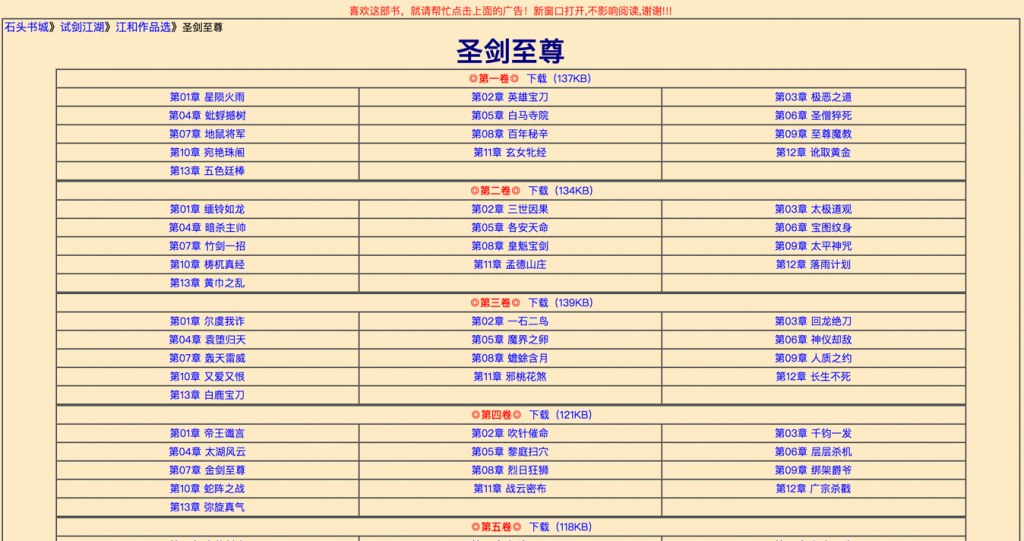
Huanjian shumeng. Wayback Machine. web.archive.org/web/20010303051953fw_/http:/hjsm.wayall.com/stone/sjjh/jh/sjzz/index.htm.
This is the phase when numerous print books (especially those from Hong Kong and Taiwan) were migrating to the Web and their texts were scanned, co-opted, and fragmented by the digital mode of publishing. The book cover was abandoned during this textual migration, for it was not considered as important as the central text. The first-generation e-lit readers in China were insatiable consumers of the text files of unofficial publications. The absence of the cover image did not concern them that much but led to the eventual divorce of the cover from the book. This technical separation is critical because it enables the book cover to achieve physical autonomy as a digital object.7
Phase 2 Optical Flatness
The digital book cover did not emerge until after the initiation of the VIP system in late 2003 at Qidian. For quite some time, the literary website was still saturated with pages of sheer texts, and not all the novels were entitled to a cover image. Only recommended VIP works enjoyed the prerogative of having one thumbnail image display on their title page (fig.5).
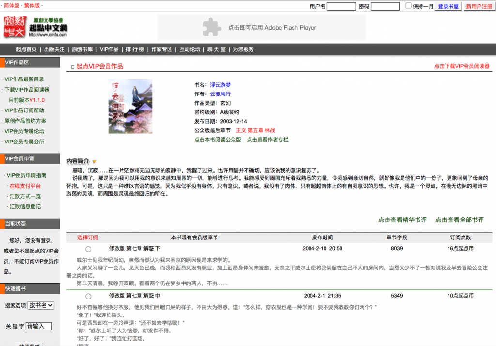
Qidian. Wayback Machine. web.archive.org/web/20040222014713/http:/www.cmfu.com/ebook_bookdtl.asp?bl_id=335.
They were the first generation of cover images for Chinese Web novels. Though from today’s perspective they look rather crude – characterized by fuzzy lines, quaint shapes, glaring lights, and spectral colors, there are historical and technological reasons for their crudeness. First, most elite cover designers at the time devoted their energy to print books and could not care less about Web novels which were viewed as a low-brow genre. Second, art editors working for the website might not be conversant with the protocols and technologies of industrial design as they were mostly trained in the Chinese fine art tradition (meishu). Third, although the digital technology sets the bar for being a DIY graphic designer very low – one can just assemble materials they find online and make a digital book cover themselves, not many authors or readers knew how to operate Photoshop back then. Therefore, it was very likely that the book covers we saw on the Web were produced by website engineers or managers who were more familiar with the basic operations of Photoshop and CorelDRAW.
Graphic designers then often remediated other popular media on the digital cover, including scanned images of print covers, celebrity photographs, anime avatars, videogame screenshots, and other readymade pictures found online. Many of the book covers hence carry both trimmings of print media and ingredients of digital media, evincing a sense of unease about migrating from the print to the digital milieu. The computer layering effect is blatantly visible as designers would aggregate graphics on multiple planes via Photoshop without obliterating inter-plane inconsistency. It is therefore not a surprise that cover designs of this phase retain or generate a feeling of optical flatness. Those raster-based cover images also recall an age of technological naiveté and prematurity whose aesthetics is awkwardly charming. Though not as deliberate as low-fi graphics, those cover images nonetheless evoke nostalgia for the pre-Internet era via flat framing, graphic juxtaposition, and chromatic aberration.
First, some covers inhabit the look of traditional Chinese beauty painting (fig.6), Japanese anime game card (fig.7), or a spiral notebook (fig.8). The edges of these covers approximate figurative patterns of a hanging scroll (fig.6), a window frame (fig.7), and a spiral bookbinding (fig.8), all of which become part of the content of the cover image. The represented framings signify the flatness of the picture plane and thrush themselves into a perception of the formal flatness of the digital cover.

Huanjian shumeng. Wayback Machine. web.archive.org/web/20050711010611/http:/www.hjsm.net/book/11640/index.php.

Huanjian shumeng. Wayback Machine. web.archive.org/web/20050522011215/http:/www.hjsm.net/book/10001/index.php

Qidian. Wayback Machine. web.archive.org/web/20040104084554/http:/www.cmfu.com/ebook_bookdtl.asp?bl_id=1751.
Second, the inclusion of flat objects asserts the flatness of the picture plane. According to Leo Steinberg, the painted mirror, window, and doorway all “soliloquize about the capacities of the surface and the nature of illusion itself” (18). For example, figure 9 is the cover image for a detective fiction. The female detective, holding an electric torch, is supposed to shine the flashlight at a criminal. Interestingly, she does not look at the direction of the criminal but turns her gaze toward the viewer of the image. The scornful way she glares at you makes you wonder whether you are the very criminal whose silhouette is captured by her flashlight. The flashlight, with its upright position, bat-shape, and clear boundary marked off against the black backdrop, propels itself into a likeness of a looking-class surface. Moreover, the detective’s body, her clothes, and the torch, resemble paper cut-outs, all flattened into geometrical abstractions, which sacrifices the sense of spatial depth as if to guarantee the detective’s dominance over a tightly surveilled façade.
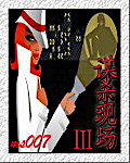
Qidian. Wayback Machine. web.archive.org/web/20090205173147/http:/mm.qidian.com/MMWeb/1099036.aspx.
Third, graphic juxtapositions also draw attention to the flatness of the picture plane. Cover designers can juxtapose a human figure with an object to indicate a semantic linkage between the two (fig.10 and fig.11). For instance, in the cover image for Talented Businessman, a long shot of a ninja on the right is juxtaposed with a close-up of a gold mine on the left, which connects martial arts to wealth (fig.10). Similarly, the cover image in figure 11 sees a mid-shot of a Chinese general in ancient armor alongside a long shot of an imperial modern highrise. The message is clear: the general is going to embark on “a mission of imperial conquest” as the novel’s title reveals. Although there is volume to both the human figure and the object, what stands out in these cover designs is the scale incongruity between them. In other words, though placed on the same surface, the human figure and the object do not inhabit and evoke the same space. And it is precisely their scalar dissonance that allegorizes the individual’s heroic pursuit of epic achievement, a central motif in Chinese Web fantasies.
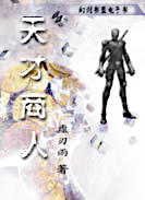
Huanjian shumeng. Wayback Machine. web.archive.org/web/20041105014422/http:/www.hjsm.net/book/7416/index.php

Qidian. Wayback Machine. web.archive.org/web/20090228151348/http:/www.qidian.com/Book/1106031.aspx.
Some cover designs intend to conjure up illusionistic space, but the human figure, awkwardly grafted onto that space, dispels such an illusion. In figure 12, for example, a knight-errant in traditional gown appears to be alighting upon the eaves of a multilevel tower. Yet, upon closer inspection, the standing knight-errant is angularly misplaced and disproportionate to the oblique tower in the back. This might have resulted from a simple Photoshop operation: cutting a human figure from another image and throwing it into this pictorial space without amending its position. In figure 13, a photo of an airship is placed above a sketch of a Chinese gentry who is looking up at the sky. The two figures cohabit the same surface but belong to different regimes of dimensionality and temporality: the illusionist image of the airship is juxtaposed with the counter-illusionist line drawing of the gentry, which implies the Chinese premodern wonder at the modern machine. These graphic juxtapositions render the cover image into a piece of collage art. Rather than being deceived, viewers may feel puzzled; instead of seeing objects in space, viewers may see nothing more than a flat picture plane (Greenberg, “Collage” 74).

Qidian. Wayback Machine. web.archive.org/web/20040222014713/http:/www.cmfu.com/ebook_bookdtl.asp?bl_id=335.

Huanjian shumeng. Wayback Machine. web.archive.org/web/20050112012352/http://www.hjsm.net/book/8159/index.php.
Fourth, the viewer’s eye is occasionally dazzled by the beams or spills of flickering light, be it the laser shots from a warrior’s hands (fig.14), or the electric blue emanating from a zombie’s face (fig.15). These luminous fluxes eradicate the image’s pictorial depth, pop out toward the surface of your screen, and declare the artificiality of digital lighting and coloring as if in a video game. The dazzling effect is heightened by the dark colors in the backdrop which evoke a partial refusal of depth. If there are multiple layers of digital coloring, the figure/ground distinction tends to collapse amid optical noises (fig.16).

Huanjian shumeng. Wayback Machine. web.archive.org/web/20050723012135/http:/www.hjsm.net/book/13957/index.php.

Huanjian shumeng. Wayback Machine. web.archive.org/web/20060218080112/http:/www.hjsm.net/book/17510/index.php.

Qidian. Wayback Machine. web.archive.org/web/20040104104353/http:/www.cmfu.com/ebook_bookdtl.asp?bl_id=2069.
The endorsement of optical flatness harks back to 1980s-1990s cover designs for Chinese bestsellers in print. Since 1980s’ reform and opening up, graphic designers in China have been borrowing from abstract expressionism, futurism, Cubism, and symbolism in Western modernist art to create cover images for print novels (Liu Wei 130). They treated the print book cover as a flat canvas for their drawings and paintings. The 1980s witnessed an era of high art serving high literature. During the 1990s, “the decade of bestseller,” more and more writers (such as Wang Shuo) and publishers (such as Writers Publishing House) turned away from the nonprofitable “pure” literature (chun wenxue) to produce pulp fictions for better market sales (Kong). The sweeping commercialization of literature not only destabilized the dichotomy of the serious and the playful, the elitist and the vernacular, the autonomous and the consumable goods, but also brokered a convergence of the avant-garde art and the popular fiction in post-socialist China. Therefore, many middlebrow and low-brow Chinese bestsellers incorporated the modernist style – which is oriented to pictorial flatness – into their cover designs in the 1990s. If modernist designs aim to create an original and unique piece of art, cover designs for Chinese bestsellers are more vernacular, not intending to invent anything new but catering to the popular tastes. For bestsellers in print, cover designers may want to embrace optical flatness as a fashionable style. Yet for digital bestsellers, the effect of optical flatness is more a result of technological insufficiency than of an intentional choice.
Phase 3 Perspective illusionism
Through the first decade of the 21st century, the toolkit for graphic design upgrades rapidly and becomes more user-friendly. More and more netizens can use image-processing application of one kind or another to produce and circulate high-resolution pictures and images. Meanwhile, the rise of the Internet and e-commerce in China propels the development and implementation of industrial design. With the booming of Chinese Web novel market, the demand for professional cover design is increasing. For any writers in search of a cover image for their online fiction, they can look for graphic designers in online forums or through personal connection; they may also turn to websites like Mo Xing Cover (https://m.mx-fm.com/) and Mo Jin Creativity (https://www.mj-cy.com/), both devoted to producing high-quality cover images for Web novels upon request. Founded in 2010, Mo Xing Cover and Mo Jin Creativity are akin to two loosely organized guilds for professional cover designers. Both websites are adept at customizing their services to match one’s needs. The level of service you receive depends on how much you are willing to pay. If you want a particular graphic designer to design your cover and revise it till your satisfaction, you should go for the “deluxe” option (diantang ji). Otherwise, you may choose to receive a “free” book cover by a newbie designer.
The websites can offer free services precisely because the designing process has been streamlined in the age of big data. An increasing number of source materials (sucai) (such as scalable vector illustrations, high-resolution graphics, and ready-made templates) have been continuously digitized, documented, and archived in many online galleries and libraries. Once the designer receives the novel’s title, short description, and associative tags, they can rummage in their shared database via keyword searches and then select relevant and quality graphics as the bases for the cover design project. Japanese anime, Chinese brush painting, Taiwan romantic series, and Hollywood action movie are generalized into stylistic filters the designer can retrieve and apply to give the book cover a distinct color hue and lighting scheme. This contributes to what I call the “algorithmic gentrification” of cover design, which drastically reduces the cost of time and effort to create a decent book cover. These book covers also make the webpages of literary portals look fancier and more stylish (fig.17).
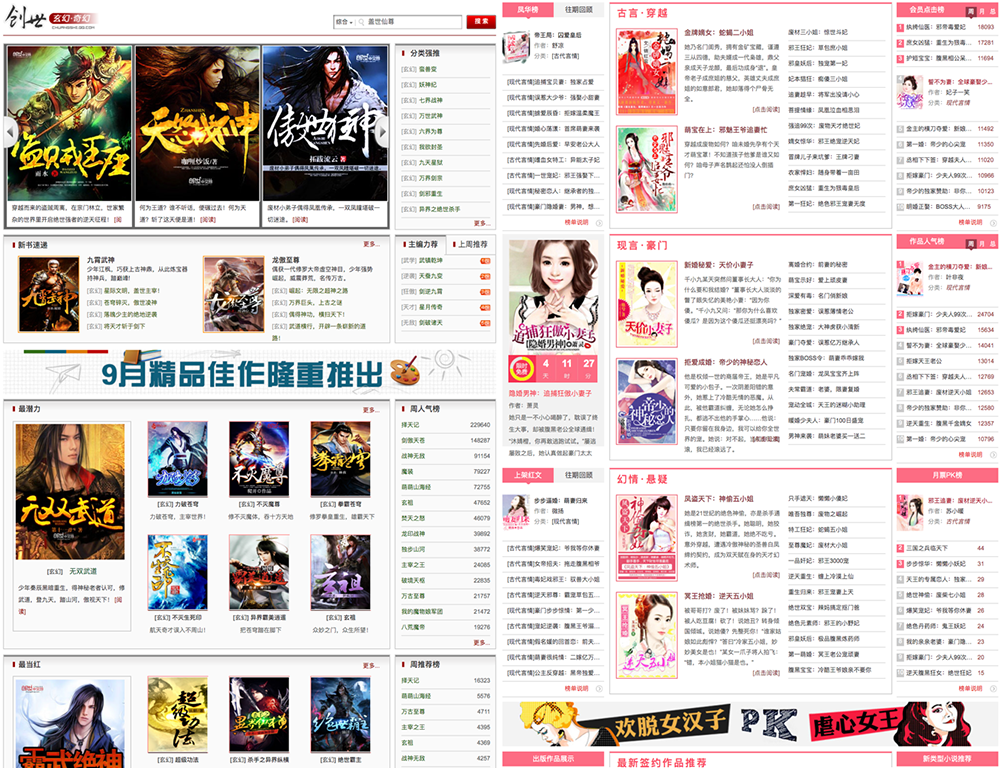
Wayback Machine. web.archive.org/web/20141003165612/http://chuangshi.qq.com:80/bk/huan/;
web.archive.org/web/20140626072639/http:/yunqi.qq.com:80/.
The gentrified cover images, no longer lingering on the digital flatland, employ perspective illusionism and verisimilitude to open a consistent world of meaning and a spectacular world of depth. Based on Roland Barthes’s rhetoric of the image, a digital book cover can be said to convey three messages: a linguistic message via the book title, a literal/denoted message and a symbolic/connotated message via the same iconic cover image (36). In comparison with cover designs in phase 2, the representational strategy of cover designs in phase 3 comprises the following features. First, the novel’s title articulates the denoted message of the cover image, whereas in phase 2, the relationship between the novel’s title and the cover image could be arbitrary and opaque (figs. 13, 14, 16). Second, the spatial configuration on each cover evokes an embodiment of three-dimensional perspective in the hope of escaping the flat plane. Third, if the cover has a figural edge, there is a mirror effect between the edge and the center of the cover image, which renders the book cover a flat plane of self-reference.
To start off, the book title helps to identify, describe, and anchor the “floating chain of signifieds” to “counter the terror of uncertain signs” in the cover image (Barthes 39). However, for the gentrified cover designs, the book title amounts to a denoted description of the cover image. The correspondence between the linguistic message and the literal message of the cover is so strong that “the terror of uncertain signs” is minimized. For example, if the title mentions “a dreamy bookstore,” you would see the bookstore’s interior shrouded in a dreamlike atmosphere on the cover (fig.18). Should the title be “a golden era,” you may find an aerial or long shot of a vibrant city bathed in sunlight (fig.19). Moreover, many graphic clichés are utilized to connotate popular genres. If it were a martial arts (wuxia) or immortal arts (xianxia) fiction, the cover would feature a solitary knight-errant in jianghu (across wild rivers, lakes, or cliffs) (fig.20), a magic weapon (fig.21), or an oriental academy for self-cultivation (fig.22), with the title writ large in Chinese ink calligraphy. If it were a sports novel, the cover would spotlight a burning ball (fig.23). If it were a romance, be it heterosexual or homosexual, a couple would be put in the center (fig.24).

Zongheng (Huayu). http://huayu.zongheng.com/book/750176.html. Accessed 30 May 2020.

Qidian. https://book.qidian.com/info/1015240612. Accessed 29 May 2020.

Chuangshi zhongwen. http://chuangshi.qq.com/bk/wx/30682691.html. Assessed 28 May 2020.

17K xiaoshuo. https://www.17k.com/book/385339.html. Assessed 28 May 2020.

Zongheng. http://book.zongheng.com/book/134807.html. Assessed 28 May 2020.

Chuangshi zhongwen. http://chuangshi.qq.com/bk/ty/724140.html. Accessed 28 May 2020.

Xiaoxiang shuyuan. https://www.xxsy.net/info/949361.html. Accessed 28 May 2020.
Furthermore, many designers contrive an illusion of depth on the cover image to better mimic the reality depicted in the novel. A rule of thumb is to configure the space on the cover through a linear perspective with added atmospheric and color effects. For example, the cover image for Violent and Arrogant God of Scythe consists of a sharp scythe in the forefront, a draped man in the middle, and a withered tree in the back, depicted in different shades of greenish grey, which altogether enhances the image’s depth of field and charge of myth, awe, and terror (fig.21). For those cover images which employ a one-point linear perspective, the vanishing point of the pictorial space may index the unknown mystery (fig.25), the secret intruders (fig.26), the inner-city pressure (fig.27), the journey’s destination (fig.28), the goal of a cybernetic game (fig.29), the utopia of the Socialist China (fig.30), etc. In my opinion, the popularity of the one-point linear perspective technique has to do with the teleological nature of Chinese Web novels. The vanishing point on each cover stands for the telos of the narrative serialization which often culminates in the ultimate success of the protagonist through their journey of grinding and battling.

by Shenfan daren (19 May 2019). Qidian. https://book.qidian.com/info/1015358282. Accessed 28 May 2020.

Feilu xiaoshuo. https://b.faloo.com/f/374255.html. Accessed 29 May 2020.

Qidian. https://book.qidian.com/info/1016440336. Accessed 29 May 2020.

Feilu xiaoshuo. https://b.faloo.com/f/408708.html. Accessed 29 May 2020

Qidian. https://book.qidian.com/info/1016024943. Accessed 29 May 2020.

Qidian. https://book.qidian.com/info/1016015280. Accessed 29 May 2020.
In phase-3 digital cover designs, perspectival illusion in the make-believe world also induces kinetic and psychic effects. The viewer, for instance, is invited to sit in a dreamy bookstore (fig.15), explore a misty mountain (fig.22), embark on a new road (fig.28), or even to inhabit alternative “geographies of time” (May and Thrift), be it historical (fig.31) or idyllic (fig.32). Some cover images are stamped with a view of the protagonist’s back, which induces the viewer not only to hold the protagonist’s point of view, but also to feel their psychological anxiety and sociopolitical power in a critical moment: an agonized detective deliberating on a case (fig.25), an engineer facing the combustion of planes (fig.33), or an ancient general receiving his troops (fig.34). These images create an illusion of space into which one could imagine oneself walking and sliding rather than merely looking.

Zongheng. http://book.zongheng.com/book/725616.html. Accessed 30 May 2020.

Zongheng (huayu). http://huayu.zongheng.com/book/45027.html. Accessed 30 May 2020.

17 K Xiaoshuo. https://www.17k.com/book/1209739.html. Accessed 30 May 2020.
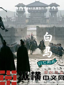
Zongheng. http://book.zongheng.com/book/76882.html. Accessed 30 May 2020.
The return to verisimilitude in this phase enables digital cover designs to deny the surface and deceive the eyes. Gone is the thrill and wonder one feels upon seeing the low-fi cover images in phase 2. Everything is now composed in a neat, clear, and transparent fashion without any optical noises. The book cover becomes a space-travel vehicle: readers, lured by the simulated depth on the cover, can easily imagine oneself plunging into the narrative world, fast and simple. We should keep in mind that the cover’s make-believe power is indebted to the algorithmic gentrification of graphic design in general. Together with Chinese Web fantasies, these cover images contribute to the “society of spectacle” (Debord) and provoke a sense of small-scale “digital sublime” which transcends “the banality of everyday life” (Mosco 3).
However, a number of digital cover designs refuse to dissemble the flat plane. Instead, they highlight the digital flatland by giving each cover a figurative framing that calls attention to its own flat quality. Here are a few examples: an illusory nebula sandwiched between orthographic drawings of white clouds (fig.35), a cat-shaped hollowed pattern encircling a simulated alley where a forensic expert is staring at a real cat (fig.36), and a sheet of paper torn open to expose a young couple separated by bookshelves in a library (fig.37). Paradoxically, though the central imagery on each cover conveys a perspectival illusion, the edge of each cover asserts its own flatness, be it a two-dimensional drawing, a wooden plaque, or a sheet of paper. Moreover, the flat periphery is also figurative. By way of mimicking the central figure (clouds, cat, and books), the figurative periphery usurps the authority of the center and turns the illusionist center into nothing more than an image mounted on the cover. Such mimetic framing not only shifts our focus from center to periphery, from figure to ground, and from substance to mediation, but also accentuates the referential loop between them.

Feilu xiaoshuo. https://b.faloo.com/f/574574.html. Accessed 29 May 2020.

Hongxiu tianxiang. https://www.hongxiu.com/book/16266913205715706. Accessed 30 May 2020.

Hongshu. https://www.hongshu.com/book/47529/. Accessed 30 May 2020.
Phase 4 Actionable Flatbed
Let us recall the divorce of the cover from the book in phase 1. No longer attached to the book, the digital cover is open to continuous revisions, updates, and migrations in cyberspace. The unprecedented liberty given to the digital image predisposes graphic designers to toy with the vertical orientation of the book cover. It is hence no wonder that horizontally-oriented book covers have started to emerge in recent years. This of course happens in the larger context of the dominant wide-screen culture, ranging from film/TV to desktop/laptop screens, all of which embrace the landscape mode. Most computer games, films, and TV programs today are also produced for the landscape aspect ratio. As human eyes are positioned horizontally, the wide screen also fits our lateral field of vision better than the tall screen.
The rise of horizontal orientation in digital cover design does not simply mean turning the book cover 90 degrees to make its height shorter than its width. It asks to revamp our conception of and relationship with the book cover. Consider this: previously, the book cover was displayed on a bookshelf; but now, you want to take it off from the shelf and lay it down on the ground, which fundamentally changes its position from standing to sleeping. This repositioning not only helps relax the “muscles” of the cover but also reorients our perception of the flat picture plane. This reorientation is best articulated by Leo Steinberg. According to Steinberg, the picture plane in the West had been conceived as an “upright surface” until around the 1950s:
The conception of the picture as representing a world, some sort of worldspace which reads on the picture plane in correspondence with the erect human posture. The top of the picture corresponds to where we hold our heads aloft; while its lower edge gravitates to where we place our feet. (27)
However, in the works of Robert Rauschenberg and Jean Dubuffet, Steinberg says, their picture planes “no longer simulat[ing] vertical fields but opaque flatbed horizontals,” and no longer depend “on a head-to-toe correspondence with human posture” (28). To signify this difference in positioning, Steinberg uses “flatbed” to call the horizontally-oriented picture plane.
The cover images I have examined so far are all vertically aligned, and perhaps it is not a surprise that the earliest effort to queer the erect picture plane comes from Chinese literary portals dedicated to danmei novels (boys love stories). Not only are there horizontal book covers, but the web pages are also laid out in a way conducive to our flipping right through the next page instead of scrolling down on the same page (fig.38).
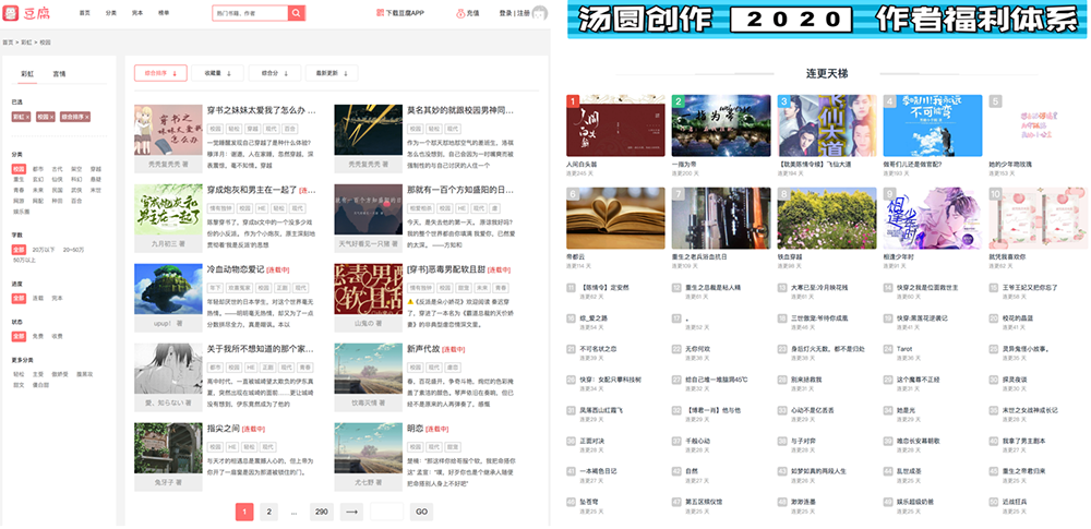
https://www.doufu.la/category-1; http://www.itangyuan.com/. Accessed 31 Dec. 2020.
The horizontal re-orientation of the digital book cover displaces the center/periphery distinction in portrait format onto the left/right compartmentation in landscape format. If a book cover mockup is placed on the one side, a backdrop image will be put on the other side of the flatbed picture plane. And more interestingly, the backdrop image often turns out to be a zoom-in or an enlargement of the same image on the book cover mockup (fig.39 and fig.40). This mise-en-abyme effect renders the cover image into a “metapicture” (Mitchell, chap.8), which reflects the medium’s self-reflexivity and recalls the referential exchange between the figure and the ground in phase 3. In my view, despite sharing the same referent, the book cover mockup and the backdrop image have different functions. The backdrop image, as a pictorial realization of the scene on the book cover mockup, demonstrates the make-believe power of the Web novel, whereas the book cover mockup at the forefront reminds us that the illusionist space in the backdrop is but an image drawn on a flat surface.

Doufu yuedu. https://www.doufu.la/novel-187951. Accessed 1 Jun. 2020.

Doufu yuedu. https://www.doufu.la/novel-206157. Accessed 1 Jun. 2020.
Another queering effect is achieved through the various allusions cover designers make to other flatbed surfaces such as “tabletops, studio floors, charts, bulletin boards–any receptor surface on which objects are scattered, on which data is entered, on which information may be received, printed, impressed – whether coherently or in confusion” (Steinberg 28). In other words, cover designers not only deny the straight position of a book cover, but also bend, warp, and even upend its straightness as a picture plane. For example, they can reconceive the flatbed picture plane as a playground where the gay couple enjoys the sensation of full gravity on their bodies (fig.41); a pond surface where turtles, tadpoles, and shrimps are swimming among green leaves (fig.42); an ancient Chinese handscroll unfolded from right to left (fig.43); a collage of frontal shots of manga characters on a billboard (fig.44), or a computer screen where the barrage of real-time comments (danmu or danmaku) are flying across from right to left (fig.45).

Doufu yuedu. https://www.doufu.la/novel-228744. Accessed 1 Jun. 2020.

Doufu yuedu. https://www.doufu.la/novel-190112. Accessed 1 Jun. 2020.

Doufu yuedu. https://www.doufu.la/novel-219367. Accessed 1 Jun. 2020.

Tangyuan chuangzuo. http://www.itangyuan.com/book/15315719.html. Accessed 1 Jun. 2020.

Doufu yuedu. https://www.doufu.la/novel-380678. Accessed 1 Jun. 2020.
Many Chinese Web fantasies are called “YY” fiction. “YY” could be the acronym of the Chinese phrase YiYin, which means wishful daydreaming. “YY” also shares the same pronunciation as “歪歪” which suggests obliqueness, deviation, and indecency.8 Therefore, to YY through Web novel is to queer the convention in print literature. In figure 41, the gay couple is not standing or sitting straight, but falling off to the ground, upside down. This brings about a feeling of disorientation for viewers. In figure 45, the novel’s title and the author’s name – supposedly the key information on the cover – are pushed to the upper left corner of the picture plane. The only image on the cover – a crying-child meme – is marginalized to the far right. Their visibility and centrality are undermined by the bullet screen of short phrases and sentences, many of which are uttered with exclamation. Where do these speeches come from? Who are the speakers? The narrator? Characters? Readers? Aren’t they also talking to each other through the posted comments? The bullet screen therefore stages not only a visual spectacle but also a cacophony of voices, which makes the book cover an unusually noisy and messy surface.
Being a “surface receptor,” the digital book cover in phase 4 proffers a liberating space for graphic designers to act on and work with. Unrelated elements can be assembled and disassembled on the flatbed (fig.44). What is conveyed is not any illusionist content but the very operational process of making the book cover a flatbed picture plane. This amounts to a liberation from the erect posture that defines the print book cover, and by analogy, the heteronormative humanity. More playful things can be done on the flatbed thanks to this conceptual reorientation.
Coda
Curiously, for websites in landscape orientation, their pages for the novel’s text are still vertically aligned (fig.46). One reason is that when it comes to reading, human eyes are more used to multiple lines in view rather than wider lines. Yet this inconsistency in literary portal design is a symptom of the larger context of literature migrating from print to digital formats. “Print is flat, Code is Deep,” Katherine Hayles claims. However, falling between the book and the Web, the digital book cover carries features of both the print and the digital protocols, which manifests in a constant oscillation between celebrating the flat surface and embracing a space of depth. Earlier cover designs would hide their digital “self” through a simulation of the print cover, whereas later designs wallow in the flatbed picture plane to declare their born-digital identity. Although earlier covers draw attention to their own optical flatness (phase 2), recent cover designs liberate themselves from the print surface by depicting an illusionist space (phase 3) or reorienting the picture plane (phase 4).
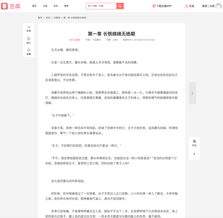
Doufu yuedu. https://www.doufu.la/chapter/1726760. Accessed 31 Dec. 2020.
It is not uncommon for new media (the Web) to imitate or simulate old media (the book) due to the latter’s antiquarian value. “In our relentlessly digital culture,”Alworth claims, “the feel of the book—its shape, size, height, weight, texture, and even its smell—has acquired new meanings and values”(1126). For Alworth, the feel of the book cover in the digital era insists contemporary literature as a regime of visual culture and manifests the aesthetics of a distinct historical moment (1126-27). It is crucial to recognize that many aspects of the feel of the print book are lost or yet to be recuperated today. What defines the aesthetics of our historical moment is none other than a convergence of print and digital media. Katherine Hayles also alerts us to the “analogue resemblance” (75) between a print and a digital interface:
Clicking on a link customarily takes the reader from one screen of text to the next. In retrospect, it is possible to see that the foundational assumption for this kind of linking comes from print books. Although the electronic linking structure differs from turning a page in that it offers multiple reading paths, it reproduces in electronic media the experience of flipping pages. (86)
This aptly describes our experience of reading Chinese Web novels. The reading interface often simulates a two-dimensional paper, and our clicking from one lexia to the next is represented as flipping through pages in a print book, each click accompanied by a page-turning sound. What one reads on each lexia is linear texts rather than interactive and multimodal hypertexts.9
This does not mean that the circulation of Chinese Web novel is not interactive or multimodal. Readers may post their comments between the lines of the narrative, in the form of overtitles flying across the screen, or in a separate discussion board. Authors can communicate with their readers and adjust the progression of the serial narrative based on readerly feedback. Quite recently, for a few literary portals, the author can insert graphic illustrations to accompany their writing or adopt word bubbles to showcase the characters’ dialogue. Yet, however interactive or multimodal the Web interface becomes, no author will live-stream their private writing process while asking for readers’ real-time feedback. Furthermore, not a single word or a single image in the main body of the serial narrative will be a hypertext link. There is only one version of the plot per installment, and the linear reading experience of each installment must be preset and protected from unexpected disruption. This still harks back to the seeming integrity of authorship and the self-enclosed textual system in print literature. Chinese Web novel, together with its cover image, is a posthumous child of the print media that lingers on the digital flatland.
+++
Acknowledgement: the author thanks Dr. Tiffany Lee (Swarthmore College), Jianqing Chen (UC Berkeley), and the anonymous reviewers for their incisive and helpful comments on an earlier draft of this paper. Special thanks go to Ms. LONG Yingbing (Alibaba Group) for sharing her knowledge and experiences as a senior UX designer in Beijing.
Works Cited
Alworth, David J. “Paratextual Art.” ELH, vol. 85, no. 4, 2018, pp. 1123–48.
Barthes, Roland. Image-Music-Text. Translated by Stephen Heath, Fontana Press, 1977.
Benjamin, Walter. “On Some Motifs in Baudelaire.” Illuminations, edited by Hannah Arendt, translated by Harry Zohn, Schocken Books, 1968, pp. 155–200.
Boyer-Dry, Margot. “Welcome to the Bold and Blocky Instagram Era of Book Covers.” Vulture, 31 Jan. 2019, https://www.vulture.com/2019/01/dazzling-blocky-book-covers-designed-for-amazon-instagram.html.
Bridle, James. “On Covers.” Booktwo.Org, 30 July 2010, http://booktwo.org/notebook/on-covers/.
Debord, Guy. The Society of the Spectacle. Translated by Donald Nicholson-Smith, Zone Books, 1995.
Feng, Jin. Romancing the Internet: Producing and Consuming Chinese Web Romance. Brill, 2013.
Flores, Leonardo. “Third Generation Electronic Literature.” Electronic Book Review, 7 Apr. 2019, https://doi.org/10.7273/axyj-3574.
Gao Hanning. “An Experimental Field of Intimacy: The ‘Female Oriented’ Cyberspace and Cultural Production.” Wenyi Lilun Yu Piping, no. 3, 2020, pp. 127–39, doi:10.16532/j.cnki.1002-9583.2020.03.013.
Genette, Gérard. Paratexts: Thresholds of Interpretation. Translated by Jane E. Lewin, Cambridge University Press, 1997.
Greenberg, Clement. “Collage.” Art and Culture: Critical Essays, Beacon Press, 1961, pp. 70–83.
---. “Modernist Painting.” Modern Art and Modernism: A Critical Anthology, edited by Francis Franscina and Charles Harrison, Westview Press, 1982, pp. 5–10.
Gunning, Tom. “The Cinema of Attractions: Early Film, Its Spectator and the Avant-Garde.” Early Cinema: Space Frame Narrative, edited by Thomas Elsaesser, British Film Institute, 1990, pp. 56–62.
Hayles, N. Katherine. “Print Is Flat, Code Is Deep: The Importance of Media-Specific Analysis.” Poetics Today, vol. 25, no. 1, 2004, pp. 67–90.
Higgins, Dick. Horizons: The Poetics and Theory of the Intermedia. Southern Illinois University Press, 1984.
Inwood, Heather. “What’s in a Game? Transmedia Storytelling and the Web-Game Genre of Online Chinese Popular Fiction.” Asia Pacific: Perspectives, vol. 12, no. 2, 2014, pp. 6–29.
Jenkins, Henry. Convergence Culture: Where Old and New Media Collide. New York University Press, 2006.
Kong, Shuyu. Consuming Literature: Best Sellers and the Commercialization of Literary Production in Contemporary China. Stanford University Press, 2005.
Little, Dena. “Have E-Readers Killed the Bookcover?” The Hub of YALSA, 24 July 2012, http://www.yalsa.ala.org/thehub/2012/07/24/have-e-readers-killed-the-bookcover/.
Liu Wei. “Dangdai Changpian Xiaoshuo Zuopin Fengmian de Tuxiang Biaoda Yu Gongneng Bianqian.” Wenyi Zhengming, no. 7, 2013, pp. 126–31.
Lugg, Alexander. “Chinese Online Fiction: Taste Publics, Entertainment, and Candle in the Tomb.” Chinese Journal of Communication, no. 4, 2011, pp. 121–36.
Manovich, Lev. The Language of New Media. MIT Press, 2002.
May, Jon, and Nigel Thrift. “Introduction.” TimeSpace: Geographies of Temporality, edited by Jon May and Nigel Thrift, Routledge, 2001.
Mendelsund, Peter. Cover. PowerHouse Books, 2014.
Mitchell, W. J. Thomas. Picture Theory: Essays on Verbal and Visual Representation. University of Chicago Press, 1994.
Mod, Craig. Hack the Cover. May 2012, https://craigmod.com/journal/hack_the_cover/.
Mosco, Vincent. The Digital Sublime. The MIT Press, 2004.
Ni, Zhanke. “Xiuzhen (Immortality Cultivation) Fantasy: Science, Religion, and the Novels of Magic/Superstition in Contemporary China.” Religions, vol. 11, no. 1, 2020, p. 25, https://doi.org/10.3390/rel11010025.
Price, Leah. “Dead Again: Every Generation Rewrites the Book’s Epitaph.” The New York Times, 10 Aug. 2012, p. A30.
Ren, Wei. The Wrier’s Art: Tao Yuanqing and the Formation of Modern Chinese Design (1900-1930). Harvard University, 2015, http://nrs.harvard.edu/urn-3:HUL.InstRepos:17465116.
Shao Yanjun. Xin Shiji Diyi Ge Shinian Xiaoshuo Yanjiu. Peking University Press, 2016.
Steinberg, Leo. “Reflections on the State of Criticism (1972).” Robert Rauschenberg, edited by Branden W. Joseph, The MIT Press, 2002, pp. 7–38.
Tufte, Edward Rolf. Envisioning Information. Graphics Press, 1990.
Williams, Raymond. Culture and Materialism: Selected Essays. Verso, 2005.
Wu Hung. “The Painted Screen.” Critical Inquiry, vol. 23, no. 1, 1996, pp. 37–79.
Yang, Renren. “Buried Alive in History: Poetics, Politics and Ethics of Time in Startling by Each Step (Bubu Jingxin) and Other Chinese Time-Travel Historical Romances.” Frontiers of Literary Studies in China, vol. 10, no. 4, 2016, pp. 699–742.
Footnotes
-
By serial design, I am referring to the experiential design of commercial literary portals in China which not only sticks readership to narrative serialization but also hierarchizes readership according to the intensity of their online activities. A successful Web novel may have hundreds or thousands of chapters whose serialization can take up to several years. A reader can access the introductory part of any Web novel for free (sometimes up to 100 chapters). If they become addicted to the story and anxious to read more, they must subscribe to the writer and pay for the daily installments (the so-called “pay-per-view” system). In return, readers can annotate any chapter, rank the novel, tip the author, and build their own fan network. As happens in a membership system, readers meeting certain requirements of the Web will be upgraded and rewarded on a continuously upward scale. See the page for VIP readership at Qidian, one of the largest literary portals in China: https://www.qidian.com/help/index/7. ↩
-
In addition to the common genres, including romance, mystery, crime, spy, detective, history, sci-fi, fantasy, urban, action, ACG, and martial arts, a plethora of innovative genres and subgenres also appear on the Chinese Web, such as rebirth, farming, workplace, web-game, tomb-robbing, immortal arts, and eastern fantasy, etc. The literary portal Wuxiaworld has an English glossary of generic idioms in Chinese martial arts, immortal arts, and eastern fantasy fiction: https://www.wuxiaworld.com/page/general-glossary-of-terms. More on the generic studies of Chinese web novels, see Feng, Inwood, Lugg, Ni, and Yang. ↩
-
The first-generation netizens in China used the Internet mainly for online chat (BBS), text delivery (email), and news release in the second half of the 1990s. A few of amateur writers published their works online, most of which were poetry, essays, and short stories (rather than the serial novel) (Shao 283–85). In other words, what is witnessed as the first wave of e-lit in the West—“pre-Web experimentation with electronic and digital media”—did not take place in China, and the first wave of e-lit in China actually coincides with the second-wave of e-lit in the West, which consists of works “created with custom interfaces and forms” (BBS and author homepages) and “published in the open Web” (Flores). The rise of the corporate mode of narrative serialization, dating to 2002/2003, signals the second wave of Chinese e-lit, which, akin to the third wave in the West, uses “established platforms with massive user bases,” ranging from literary portals to mobile apps (ibid.). Different from Western e-lit which gets purchase on spectacular multimedia user-interface, a running feature of Chinese e-lit is its text-heavy and linear-driven mode of production and consumption, which can be partially held accountable for the disregard of graphic component in the Chinese e-lit. ↩
-
Margot Boyer-Dry points out how Amazon and Instagram have reformed the design of a book cover. In an age of “statement wallpaper and fatty text,” book covers have to look great in miniature: designers now abandon the more delicate type on a print cover and embrace a larger type which plays better on a digital thumbnail. However, the advertising function of a book cover persists: “a book that pops in a filtered miniature Instagram still life can declare its presence just as loudly from across the room” (Boyer-Dry). ↩
-
In Chinese, “graphic design” is translated as “pingmian sheji” which literarily means “flat surface design.” ↩
-
My overview of cover images does not mean to be encyclopedic; neither can it be. My selection of sample covers is based on three considerations: 1) available in Internet Archive; 2) from major Chinese literary portals of its time; 3) from a range of fictional genres. It is not useful to map the literary quality of the Web novel onto their cover design because a banal story may have a splashy cover, and a highbrow novel may have a spoofy cover in cyberspace. Further, what constitutes the “literariness” of fiction and the “artistry” in cover design is subject to debate. It would be more helpful to explore, for instance, the seeming mismatch between a “literary” novel and a “kitsch” cover design, or a provocative cover design for an unfinished novel. ↩
-
The print book cover may also achieve a certain autonomy if it is circulated as a piece of artistic painting via exhibitions and publications. For instance, the Republican-era painter Tao Yuanqing would convert his painting into a cover image for the famous writer Lu Xun’s not-yet-written book, which not only declares the cover’s precedence over the book, but also compels the book to serve the cover (Ren 189). ↩
-
The Chinese character “歪” is composed of two parts: the upper part “不” meaning “not,” the lower part “正” meaning “straight,” so altogether this character means “not straight.” ↩
-
Note that in figure 1, the book image is still presented in an angle to simulate its three-dimensional object-ness as a print volume. ↩
Cite this article
Yang, Renren. "Reconfiguring Flatness on Screen: A Short History of Cover Designs for Chinese Web Novels" Electronic Book Review, 7 March 2021, https://doi.org/10.7273/gf8q-8d91